Travconnect
A mobile App that enable travellers connect with others as they travel on a solo trip
Travconnect aims to help users connect with people when traveling on a solo trip, by leveraging superb user interface and experience to enable users learn interesting things from others and share their experiences.
Project
TravConnect
Services
User Research UX Design UI Design
Industries
Travel
Tools
Figma Miro Jira
Problem Discovery
One of the many reasons Solo travelers enjoy traveling alone is because of the freedom and flexibility that it comes with. However, to make the best of their trip, they want to connect with others so that they can learn interesting things from others, share memorable experiences and feel safer.
While conducting early interviews with our potential users (graduates & early professionals), many of them want to connect with others when they travel alone so that they can maximize their travel experiences. This sparked an overarching question
How might we create an enabling platform for them to connect with others as they travel alone ?

My Role
I led the overall design process and oversaw aspects related to product scoping, user flows, wireframes, rapid prototyping, and usability testing. Additionally, I conducted user research, and contributed in synthesizing research findings to produce viable ideas.
The Team
1 Product designer,
1 product manager
1 front-end developer
1 back-end developer
1 QA Tester
Timeline
6 Weeks
Research Process
The design sprint commenced with general competitor research and drafting of proto-personas to help me better formulate my understandings. Subsequently I was then able to generate hypothesis and conducted the interviews which enabled me to identify several key findings. With my interviews I sought to understand user habits regarding connecting with others, what kind of concerns they had regarding their safety and apps that they use? Each interview questions drilled into specific behaviours and concerns. Asides user interviews I also gained more insight into general Travel apps by reading reviews, on Google Play and iTunes. This was a great way to learn what problems people had with existing products.
During the course of the interviews, I spent a bit time asking for their background and establishing what their mental model was as well as their expectations. I asked questions such as; How frequently they traveled, what past experiences they've had, how they connect with people when they travel, what motivates them to connect, if they have previously used any mobile app or website that helps them connect with people when on a solo trip? and why I interviewed 3 women and 3 men, with ages ranging from 25 to 40. Below are highlight of questions from the interviews:
Interview Questions
How often do you travel?
When was the last time you traveled? why
What do you think about when you travel? Any other thing?
How do you connect with people when you travel? Why? Can you explain more?
What would motivate you to connect ?
Can you tell me about a time you connected with someone when you traveled? How was the experience? What platform did you connect with ? why did you connect ?
Can you tell me about any frustration/challenges you face with the way you connect with people when you travel? How do you overcome the frustration?
Have you previously used any mobile app or website that helps you connect with people when on a solo trip? why
If yes, what were your experiences and frustrations?
What do you expect in a mobile app that lets you connect with people when to travel on a solo trip?
What would you want to achieve when using a travel app?
Connecting ideas
The ideas and insights, based on the data obtained from the User interview and secondary research, were organized into groups. Then it became possible to define the problem, developing new insights that became potential solutions for the app.
It is important to note that processes throughout this project were not linear and that there was often a need to modify things and make upgrades in the various stages. The affinity diagram, accompanied by brainstorming, is an illustrative example of the non-linear process. It has been revised several times throughout this project.
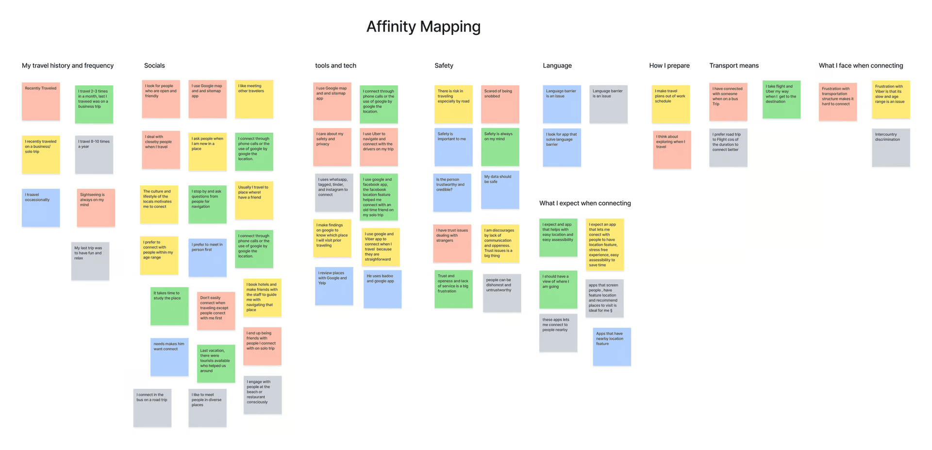
View the Figjam file of the Affinity Map here
Empathizing with Proto-Personas
Once having concrete data and validations of our initial suppositions it was essential to create the personas so that we can gain empathy with users and so we can have a better understanding of their needs, frustrations, and motivations and behaviours.
It is important to understand why these personas feel and act in a certain way to understand in-depth which users we are drawing for.
The personas make the design process less complex and lead us to the process of ideation.

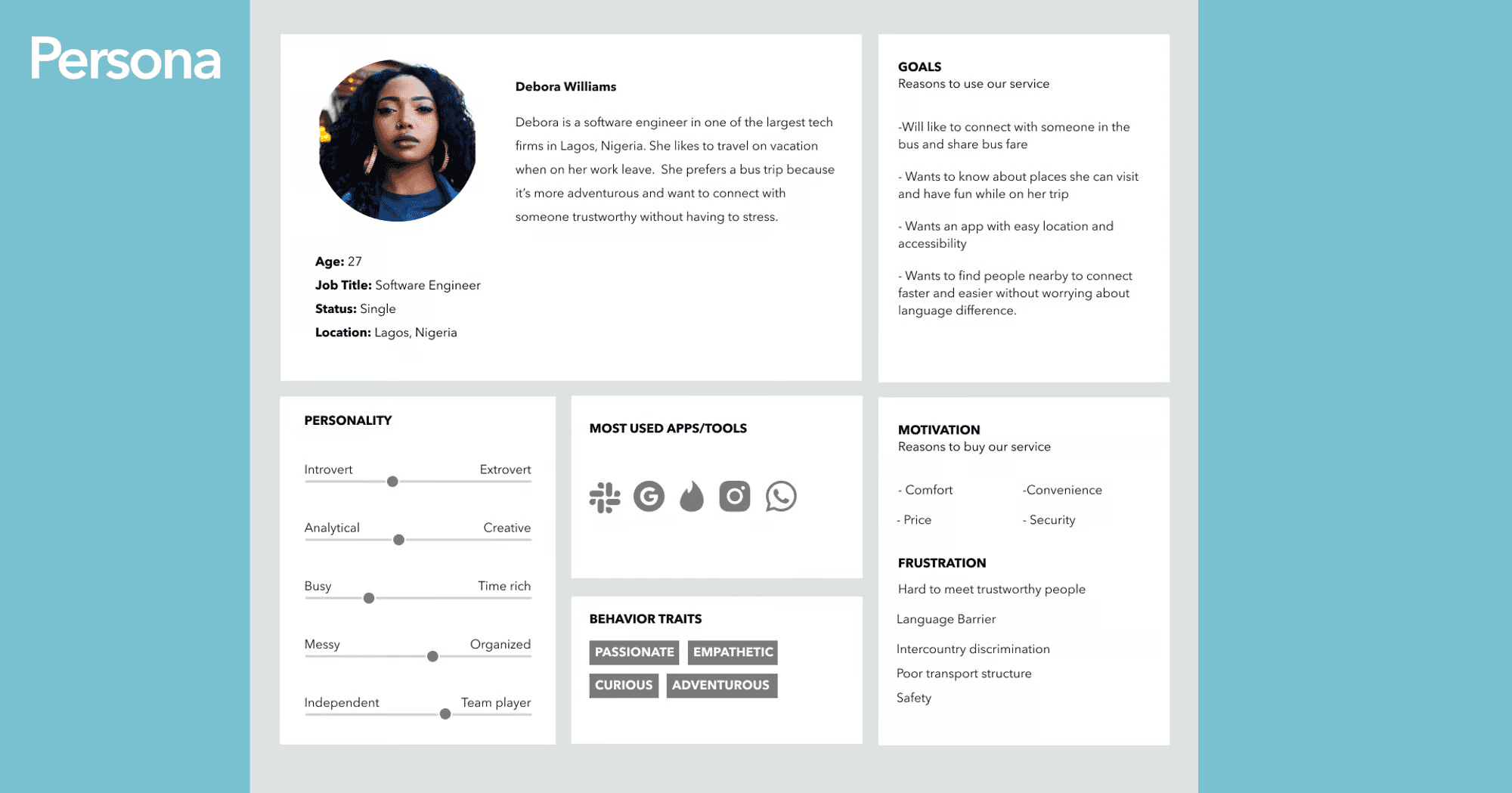
Key Insights
Simplicity and convenience is very important to users.
Safety concerns is popular with most people, especially when they are new to the travel location of their choice
Language barrier seems to be a significant issue to connecting when on a solo trip
Redefining and simplifying the process
Based on the insights and analyses made so far, it was possible to gain a concrete idea of the problems and possible solutions for this project. When organizing the information, the goal was to make the complex system of the app into something understandable, accessible, and with a rewarding user experience. Throughout this stage, the closed card sorting methodology was used to help design the intended architecture and user flow for this project.

First approach to solutions
Based on previous research, it was possible to design wireframes that could provide an experience which was intuitive for the user. In the beginning, the wireframe was sketched with pen and paper so as to quickly start developing the ideas. After structuring the concept ideas, it was possible to design the mid-fidelity wireframe.The goal when building the mid-fidelity wireframe was to test it with several users. This made it possible to gain insights into their experience while performing specific tasks. During this process several elements were used, such as texts and icons that could represent the final prototype.


Wireframe sketch for some important screens
Low Fidelity Wireframes
The first set of onboarding screens will enable users easily sign up or sign in

Onboarding screens


Home page and other screens
Usability testing revealed that users generally liked the large imagery of carousels. Ultimately, I carried out some Heuristics evaluation to ensure the screens meets the usability criteria judging using the 10 Jakob Nielson’s heuristics principles.

Hotel recommendations and Profile screens
Design Styles for consistency and efficiency
The design styles is a collection of assets and components that are used to build a digital product. A design style also serves to explain why and how to use these assets and components. It becomes easier to use and apply the components when a style guide exists. It also guarantees consistency in the design process of creating an interface. The process of creating a style guide is dynamic and develops in parallel with the initial phase of the high-fidelity prototype, since it is only possible to define some components after seeing them inserted in the context of the interface.

Putting it all together in High Fidelity Prototypes
Once the visual part was ready alongside the insights from the usability test carried out on the mid-fidelity prototype, it was possible to design the high-fidelity prototype. The purpose of the high-fidelity prototype is to validate the concepts obtained from the previous processes.
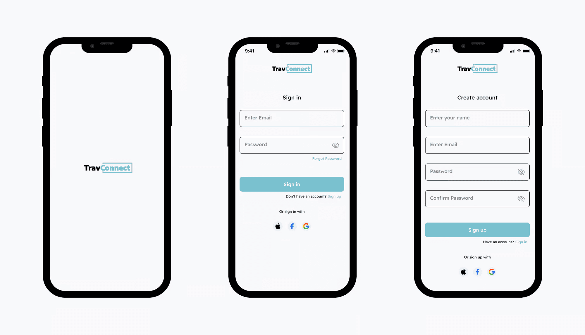
Sign in / Sign up screen
The login and signup screens were designed to be as simple and seamless as possible, with the addition of social media login to incentivize users to either create an account or login easily.
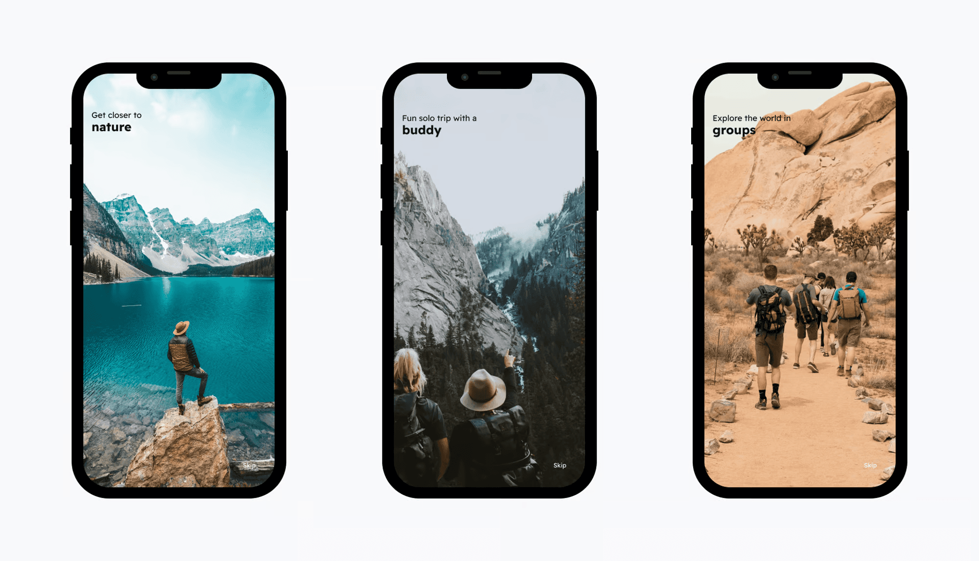
Onboarding Screens
The onboarding process was designed to give our users an idea of what to expect when they join.
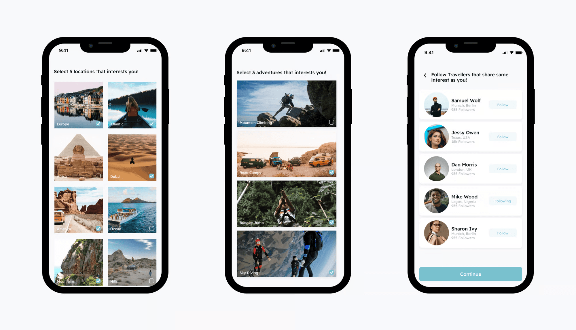
Choose locations and adventures of interest/ Follow travelers
Upon onboarding, you can choose locations and adventures that interest you and also follow travelers that share same interest with you.
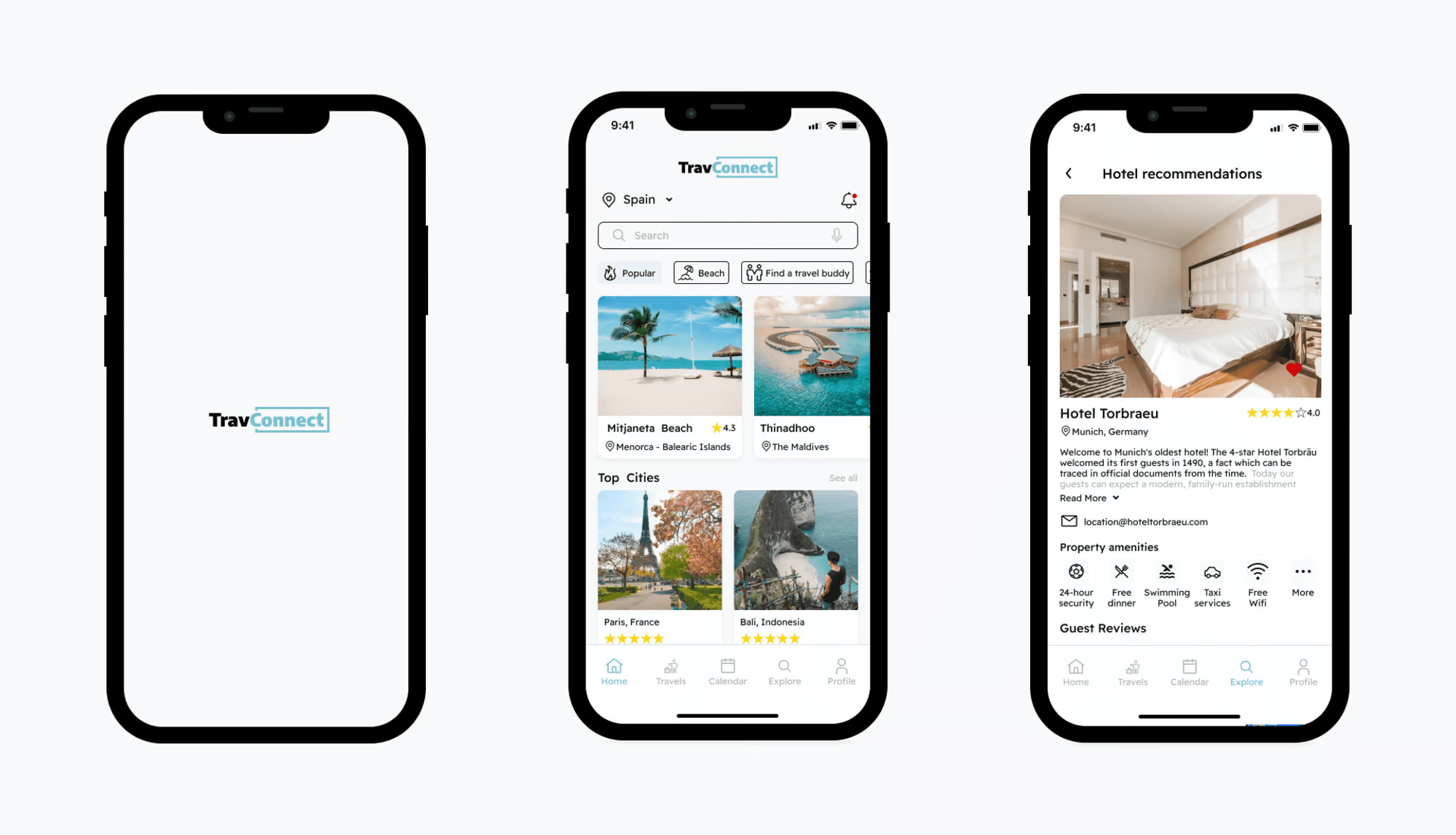
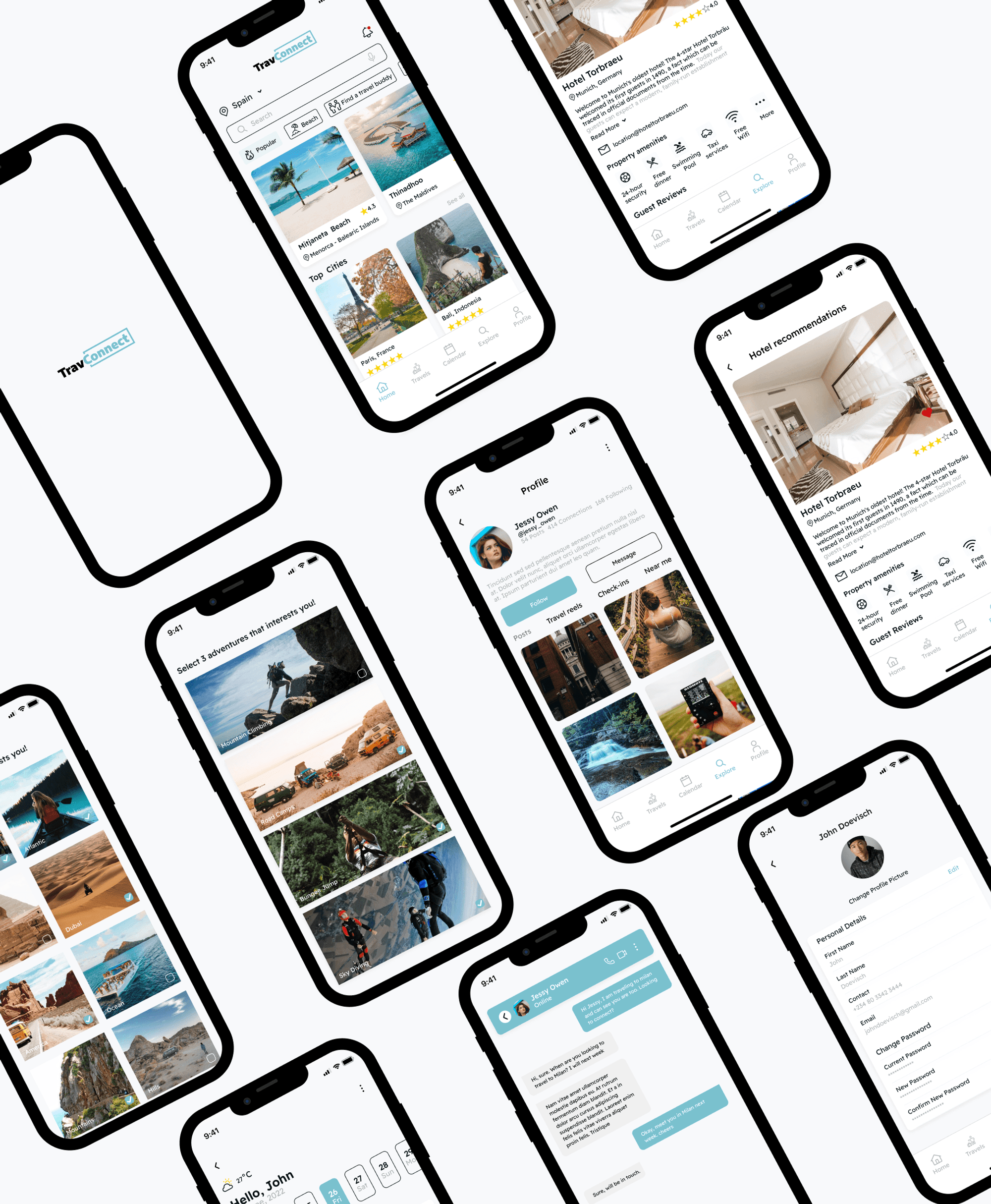
Home Screen / calendar screen
On the home screen, users can see popular locations to visit, find a travel buddy, see hotel recommendation previously used and rated so they can make decisions to where to lodge. They get to add their picks to their calendar for future reference.

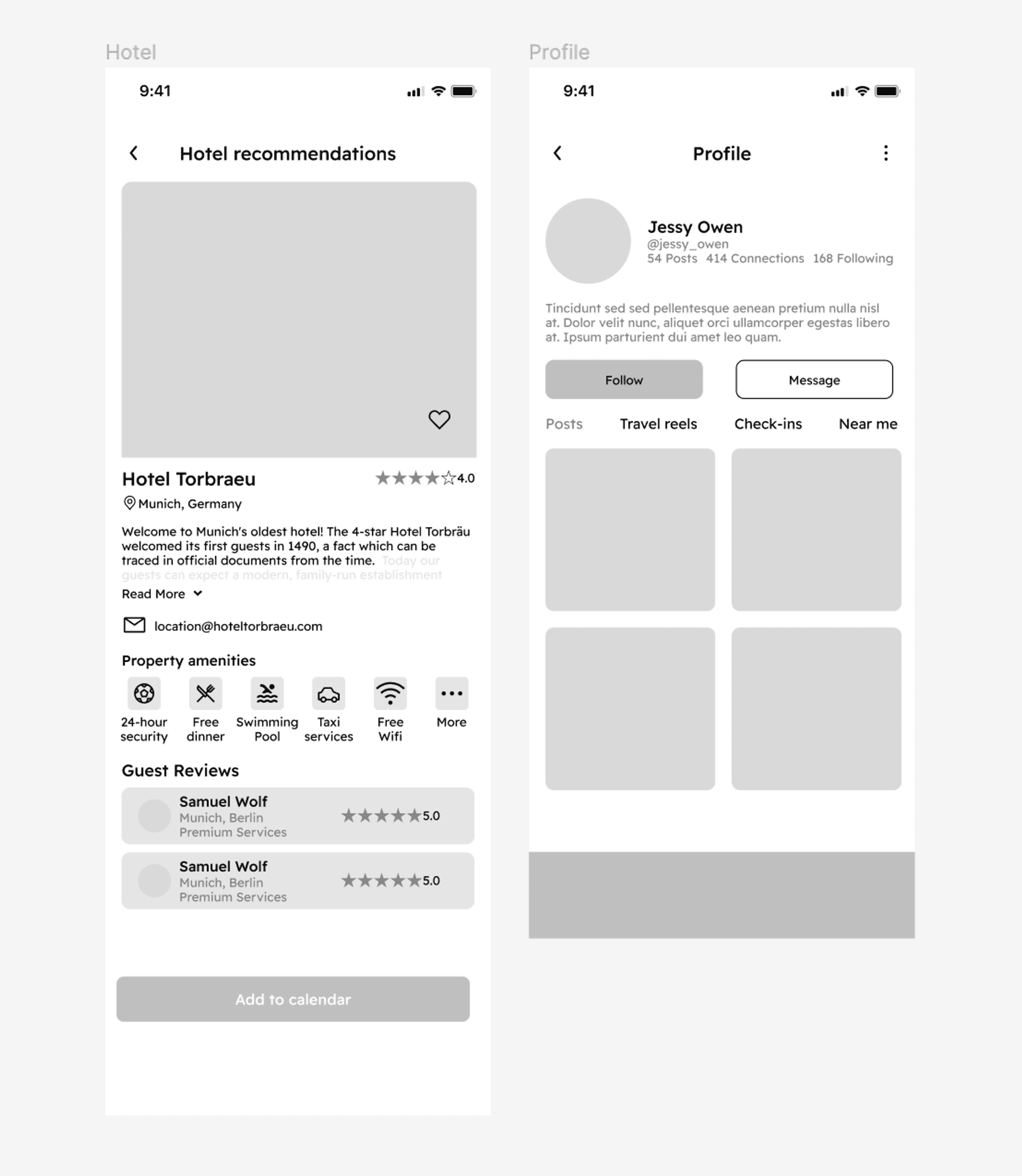
Profile Screen / Hotel recommendation
Here is the profile screen, users can edit profile and change password seamlessly. Users stressed the difficulty they experienced choosing hotels to stay at, hence the Hotel recommendation which enables our users to see recommended hotels, guest reviews and available amenities in the hotel as well as the hotel ratings.

Find a travel buddy
The find a buddy screen enables users reach out a travel buddy, see their profile and chat them up to talk about the location they are traveling to and if they would want to connect.

Problem Discovery
One of the many reasons Solo travelers enjoy traveling alone is because of the freedom and flexibility that it comes with. However, to make the best of their trip, they want to connect with others so that they can learn interesting things from others, share memorable experiences and feel safer.
While conducting early interviews with our potential users (graduates & early professionals), many of them want to connect with others when they travel alone so that they can maximize their travel experiences. This sparked an overarching question
How might we create an enabling platform for them to connect with others as they travel alone ?
My Role
I led the overall design process and oversaw aspects related to product scoping, user flows, wireframes, rapid prototyping, and usability testing. Additionally, I conducted user research, and contributed in synthesizing research findings to produce viable ideas.
The Team
1 Product designer,
1 product manager
1 front-end developer
1 back-end developer
1 QA Tester
Timeline
6 Weeks
Research Process
The design sprint commenced with general competitor research and drafting of proto-personas to help me better formulate my understandings. Subsequently I was then able to generate hypothesis and conducted the interviews which enabled me to identify several key findings. With my interviews I sought to understand user habits regarding connecting with others, what kind of concerns they had regarding their safety and apps that they use? Each interview questions drilled into specific behaviours and concerns. Asides user interviews I also gained more insight into general Travel apps by reading reviews, on Google Play and iTunes. This was a great way to learn what problems people had with existing products.
During the course of the interviews, I spent a bit time asking for their background and establishing what their mental model was as well as their expectations. I asked questions such as; How frequently they traveled, what past experiences they've had, how they connect with people when they travel, what motivates them to connect, if they have previously used any mobile app or website that helps them connect with people when on a solo trip? and why I interviewed 3 women and 3 men, with ages ranging from 25 to 40. Below are highlight of questions from the interviews:
Interview Questions
How often do you travel?
When was the last time you traveled? why
What do you think about when you travel? Any other thing?
How do you connect with people when you travel? Why? Can you explain more?
What would motivate you to connect ?
Can you tell me about a time you connected with someone when you traveled? How was the experience? What platform did you connect with ? why did you connect ?
Can you tell me about any frustration/challenges you face with the way you connect with people when you travel? How do you overcome the frustration?
Have you previously used any mobile app or website that helps you connect with people when on a solo trip? why
If yes, what were your experiences and frustrations?
What do you expect in a mobile app that lets you connect with people when to travel on a solo trip?
What would you want to achieve when using a travel app?
Connecting ideas
The ideas and insights, based on the data obtained from the User interview and secondary research, were organized into groups. Then it became possible to define the problem, developing new insights that became potential solutions for the app.
It is important to note that processes throughout this project were not linear and that there was often a need to modify things and make upgrades in the various stages. The affinity diagram, accompanied by brainstorming, is an illustrative example of the non-linear process. It has been revised several times throughout this project.
View the Figjam file of the Affinity Map here
Empathizing with Proto-Personas
Once having concrete data and validations of our initial suppositions it was essential to create the personas so that we can gain empathy with users and so we can have a better understanding of their needs, frustrations, and motivations and behaviours.
It is important to understand why these personas feel and act in a certain way to understand in-depth which users we are drawing for.
The personas make the design process less complex and lead us to the process of ideation.
Key Insights
Simplicity and convenience is very important to users.
Safety concerns is popular with most people, especially when they are new to the travel location of their choice
Language barrier seems to be a significant issue to connecting when on a solo trip
Redefining and simplifying the process
Based on the insights and analyses made so far, it was possible to gain a concrete idea of the problems and possible solutions for this project. When organizing the information, the goal was to make the complex system of the app into something understandable, accessible, and with a rewarding user experience. Throughout this stage, the closed card sorting methodology was used to help design the intended architecture and user flow for this project.
First approach to solutions
Based on previous research, it was possible to design wireframes that could provide an experience which was intuitive for the user. In the beginning, the wireframe was sketched with pen and paper so as to quickly start developing the ideas. After structuring the concept ideas, it was possible to design the mid-fidelity wireframe.The goal when building the mid-fidelity wireframe was to test it with several users. This made it possible to gain insights into their experience while performing specific tasks. During this process several elements were used, such as texts and icons that could represent the final prototype.
Wireframe sketch for some important screens
Low Fidelity Wireframes
The first set of onboarding screens will enable users easily sign up or sign in
Onboarding screens
Home page and other screens
Usability testing revealed that users generally liked the large imagery of carousels. Ultimately, I carried out some Heuristics evaluation to ensure the screens meets the usability criteria judging using the 10 Jakob Nielson’s heuristics principles.
Hotel recommendations and Profile screens
Design Styles for consistency and efficiency
The design styles is a collection of assets and components that are used to build a digital product. A design style also serves to explain why and how to use these assets and components. It becomes easier to use and apply the components when a style guide exists. It also guarantees consistency in the design process of creating an interface. The process of creating a style guide is dynamic and develops in parallel with the initial phase of the high-fidelity prototype, since it is only possible to define some components after seeing them inserted in the context of the interface.
Putting it all together in High Fidelity Prototypes
Once the visual part was ready alongside the insights from the usability test carried out on the mid-fidelity prototype, it was possible to design the high-fidelity prototype. The purpose of the high-fidelity prototype is to validate the concepts obtained from the previous processes.
Sign in / Sign up screen
The login and signup screens were designed to be as simple and seamless as possible, with the addition of social media login to incentivize users to either create an account or login easily.
Onboarding Screens
The onboarding process was designed to give our users an idea of what to expect when they join.
Choose locations and adventures of interest/ Follow travelers
Upon onboarding, you can choose locations and adventures that interest you and also follow travelers that share same interest with you.
Home Screen / calendar screen
On the home screen, users can see popular locations to visit, find a travel buddy, see hotel recommendation previously used and rated so they can make decisions to where to lodge. They get to add their picks to their calendar for future reference.
Profile Screen / Hotel recommendation
Here is the profile screen, users can edit profile and change password seamlessly. Users stressed the difficulty they experienced choosing hotels to stay at, hence the Hotel recommendation which enables our users to see recommended hotels, guest reviews and available amenities in the hotel as well as the hotel ratings.
Find a travel buddy
The find a buddy screen enables users reach out a travel buddy, see their profile and chat them up to talk about the location they are traveling to and if they would want to connect.
Usability testing The next thing i did was set up a remote usability test with participants sourced through our organization’s newsletter. The process of selecting and filtering research participants was handled by the product owner. I created a test plan, facilitated the test while being observed by other members of the team and two stakeholders, i also analyzed the data and created a usability test report. The metrics i was measuring for are: 1: Task success rate - 60% Of selected participants completed the set tasks without being lost 2: Time for task completion : 50% of research participants completed the task within stated time period 3: Error rate: 30% of research participants recorded errors during the task 4: User subjective satisfaction: 80% of the research participants said the task process was satisfactory The findings from the usability test validated our design decisions and we proceeded to handoff and implementation.
I specialize in crafting exceptional digital experiences to help businesses achieve their goals.
Designed by Emmanuel Olubodun
I specialize in crafting exceptional digital experiences to help businesses achieve their goals.
Designed by Emmanuel Olubodun
I specialize in crafting exceptional digital experiences to help businesses achieve their goals.
Designed by Emmanuel Olubodun