finGet Mobile Application
A financial management app for better budgeting and savings
finGet is a financial management app for budgeting and savings, that helps users track their finances, access financial resources, and improve their financial literacy in an engaging way.
Project
finGet
Services
User Research UX Design UI Design
Industries
Fintech
Tools
Figma Miro Jira
PROJECT BRIEF
Our users were experiencing issue with managing their finances and found it even difficult to budget and save and this was due to lack of a platform to trust with their data and information. They also experienced some frustration with the complexity of financial platforms which make it difficult for them to understand because of the text heaviness of those platforms, thus reducing their engagement on such platforms which in turn has a negative impact on their financial literacy.
💡 We had an overarching question throughout this project which was:
How might explore how to improve Financial Literacy
GOALS
Create a Fintech mobile application that streamlines a user’s financial process to help them reach their goals with ease. This application will simplify the user’s experience through the use of visualization and less text, and create an engaging experience with an interface similar to popular social media applications. Users will also have the option to link their bank to the app or decide to manually input their transactions, removing the challenge users face with security.
THE PROBLEM
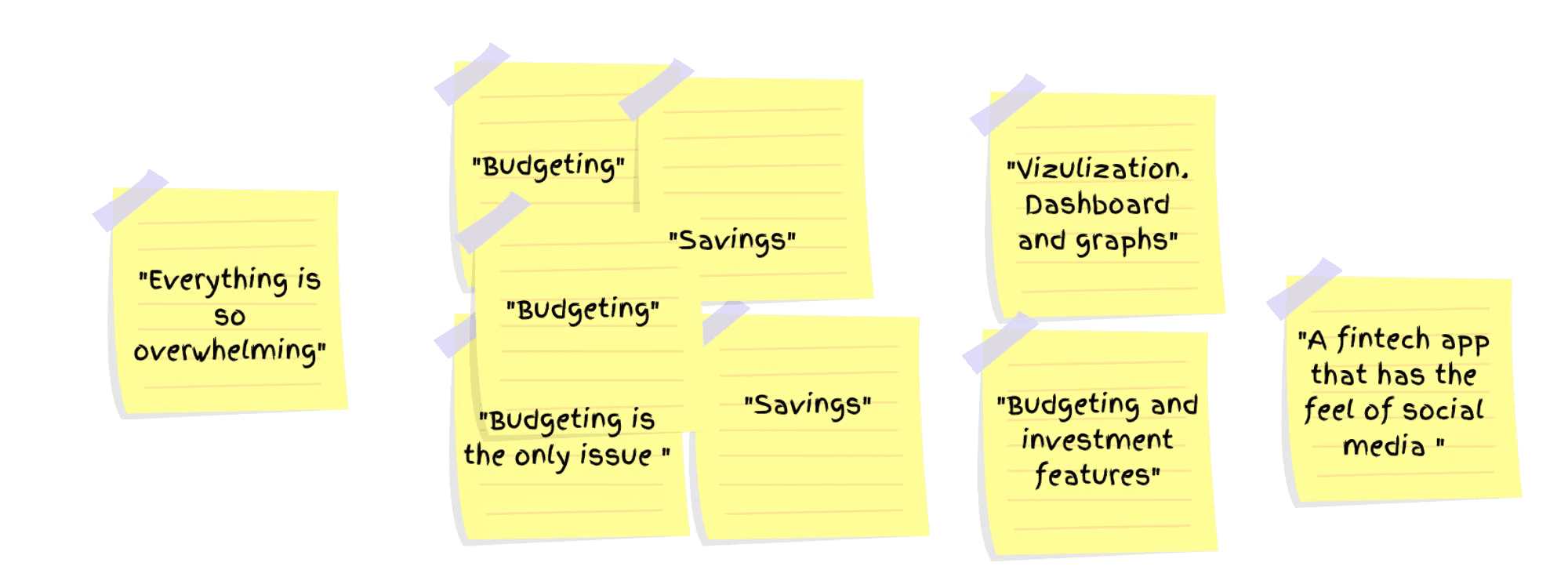
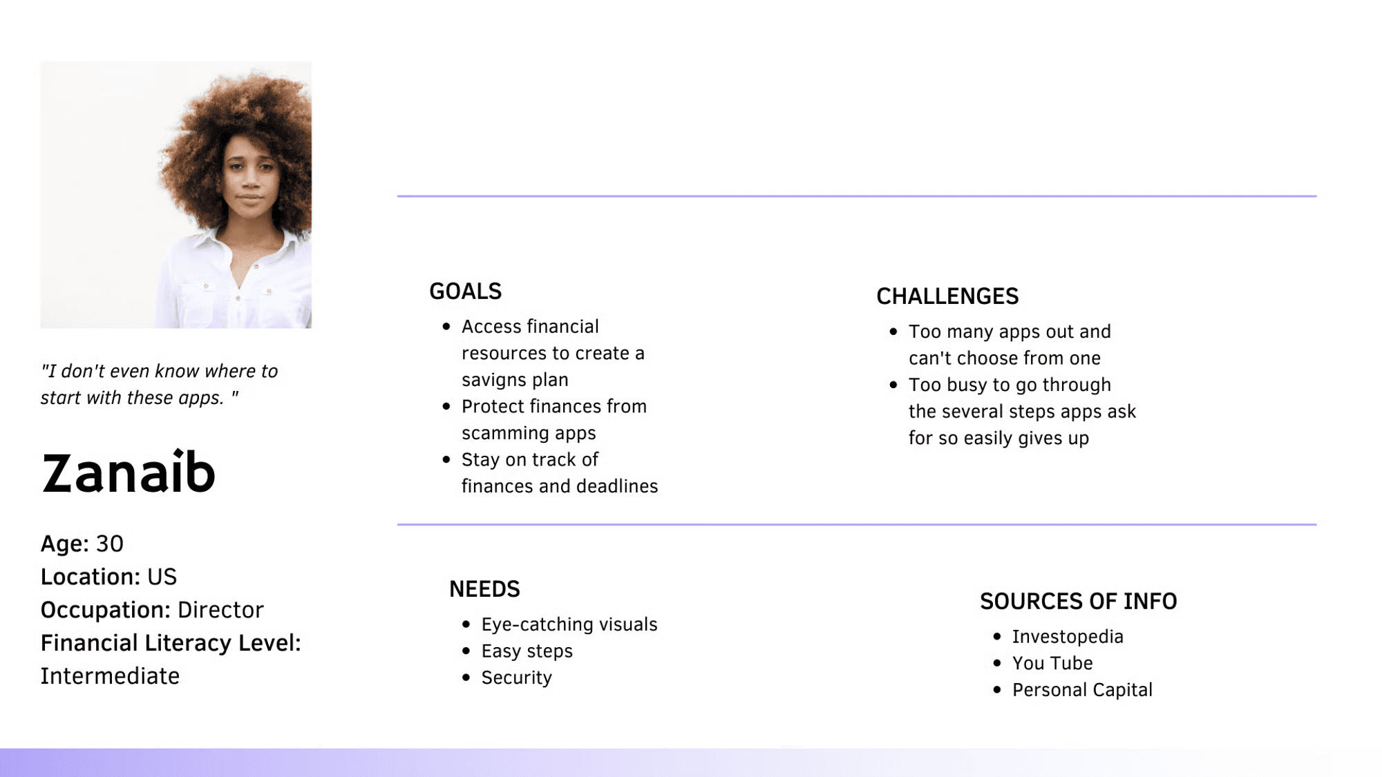
Adulting is hard. As a young adult, learning to manage your finances, create a budget, and saving plan is harder. According to 42% of our users, nothing is harder than finding an app that makes this process simple, entertaining, and also makes them feel secure. Even users with an Intermediate level of experience with financial literacy report not knowing where to find financial resources, to expand upon what they currently know.
MY ROLE
I functioned as the Product designer and UX researcher in the team, 1 ux researcher, a product manager and 1 Front end engineer, 1 Backend engineers. I was responsible for user research, Information architecture, wireframing and high fidelity prototyping, usability testing.
TIMELINE
4 Weeks
RESEARCH SUMMARY
We conducted secondary research to learn more about financial literacy and surveyed 69 adults between the ages of 18-35 to determine the pain points of young adults understanding their experience in accessing financial literacy, their goals, and motivations. Open-ended questions allowed us to discover a lot about our users. Link to Survey Research
The goal was to design a product that is easy to use and addresses frustrations that arise from using existing solutions, this way the product can truly stand out of out of competition. To achieve this we used the Double Diamond Model to explore issues divergently (exploring in an open manner) and convergently (taking more focused actions).

MAPPING OUT THEIR EMOTIONS

IDENTIFYING THE USERS

PAINPOINT
Budgeting: User's want to find ways to budget, track expenses and save, but often need reminders.
Security/Consistency: User's can't seem to find an app they can trust with their financial information.
Lack of awareness: There are too many apps out today and they have no clue which apps to trust to learn more about financial literacy.
Complexity: User's are unable to digest apps that are too "wordy." Their time is limited and they need the information to be digestible and fast.
DESIGNS
The design objective was to utilize the UX research to foster simplicity and ease of use of the app. The user flow map paved the way for the first iteration of sketches, I was able to sketch all my ideas for the app experience and tried to translate it to content and the main tasks on the screens.
APP FLOW
A breakdown of the user journey when interacting with the application. The framework focuses only on the functionality behaviour and content of the app

FIRST APPROACH TO THE SOLUTION
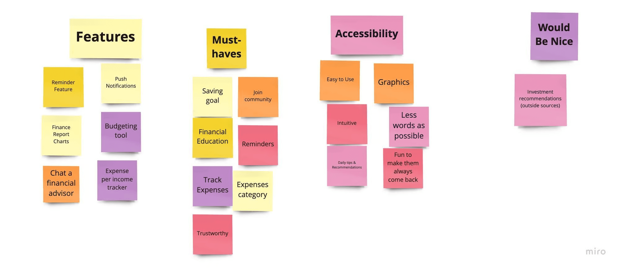
We did the Crazy 8's sketching and "How Might We" exercise to come up with the best possible solutions for our design. The paper sketches were drawn after the Userflow was created.

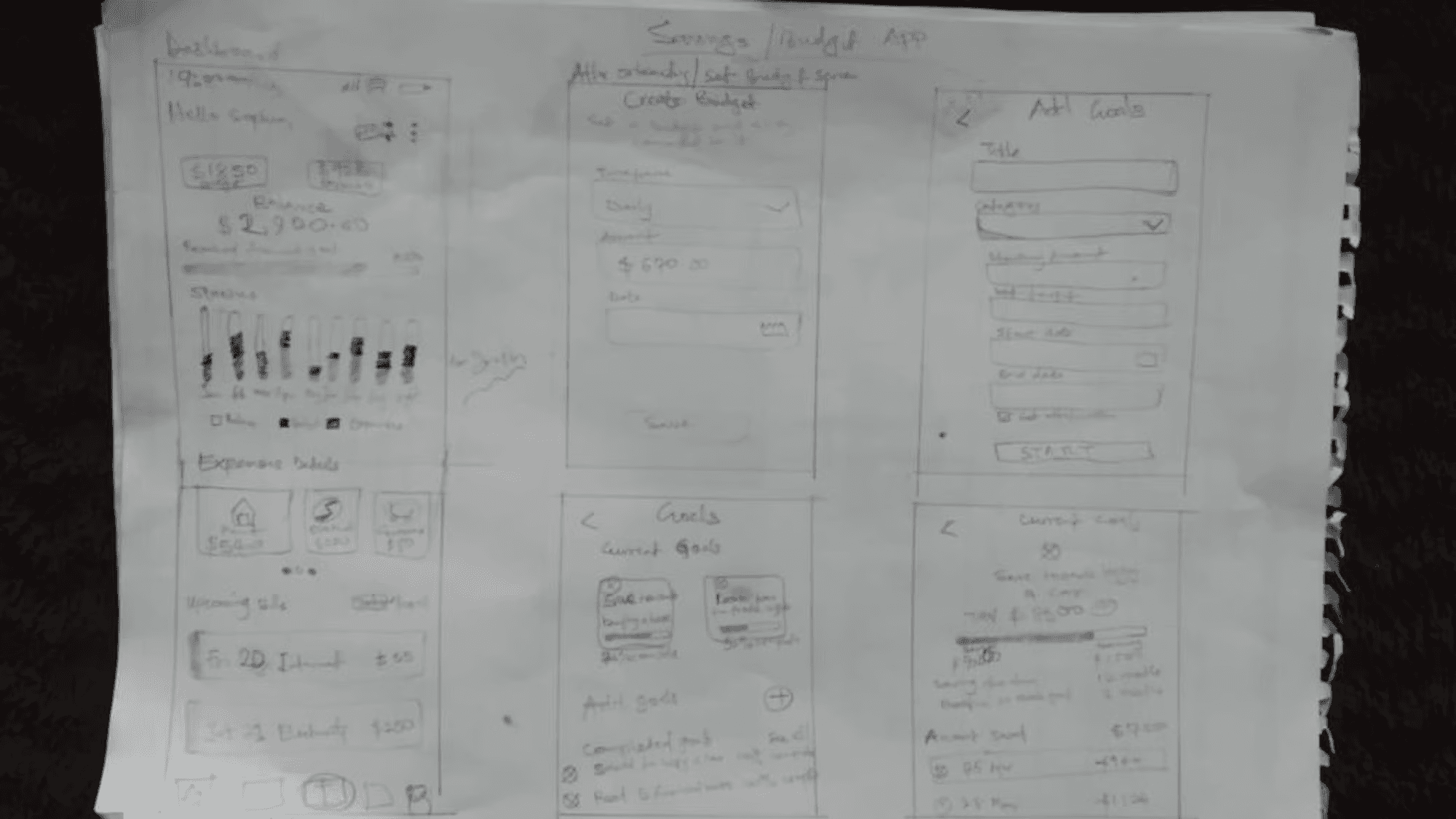

LOW-FIDELITY DESIGNS
Onboarding Screens

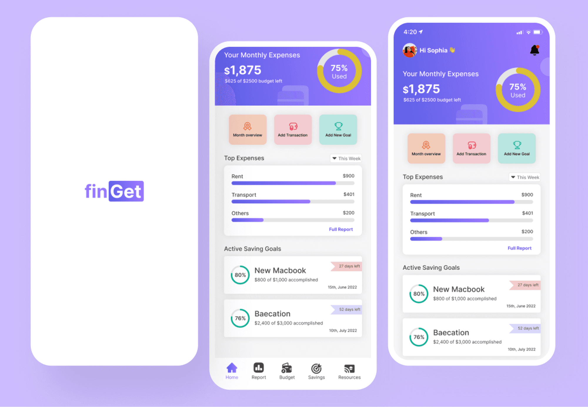
Home Dashboard Screens
Savings Goals Screens

Budget Screens
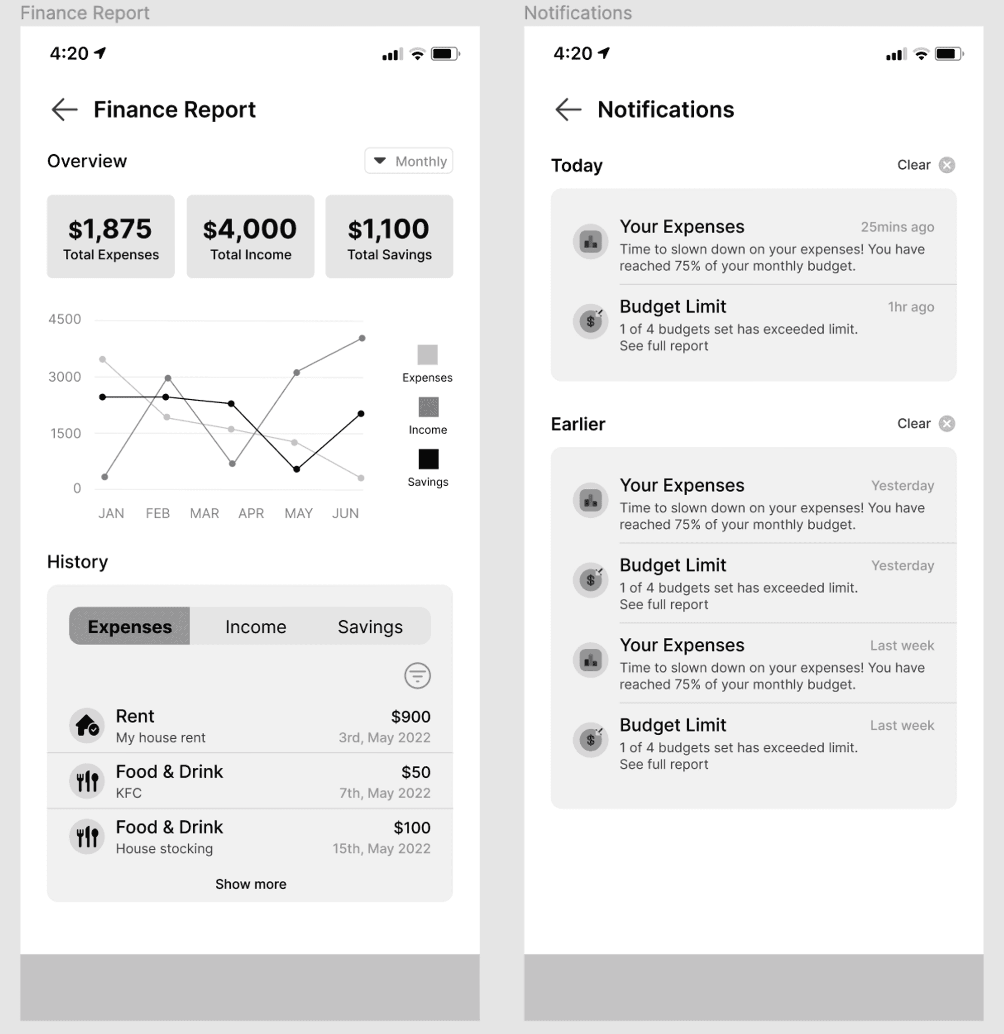
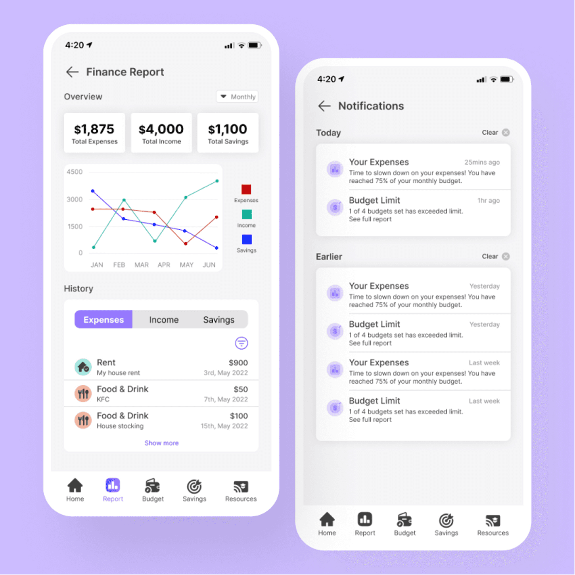
Financial Report and Notification Screens
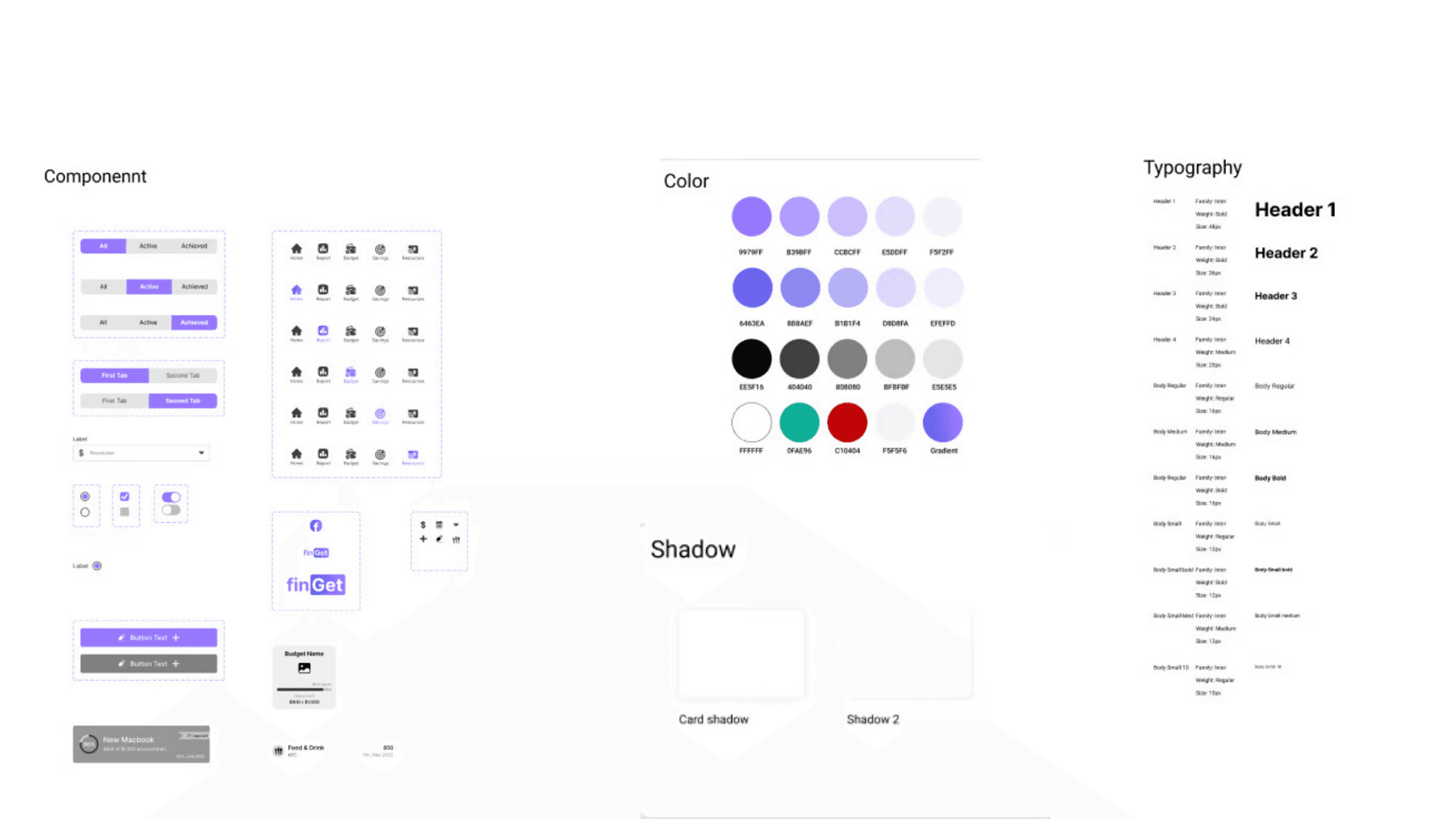
DESIGN SYSTEM
HIGH-FIDELITY DESIGNS
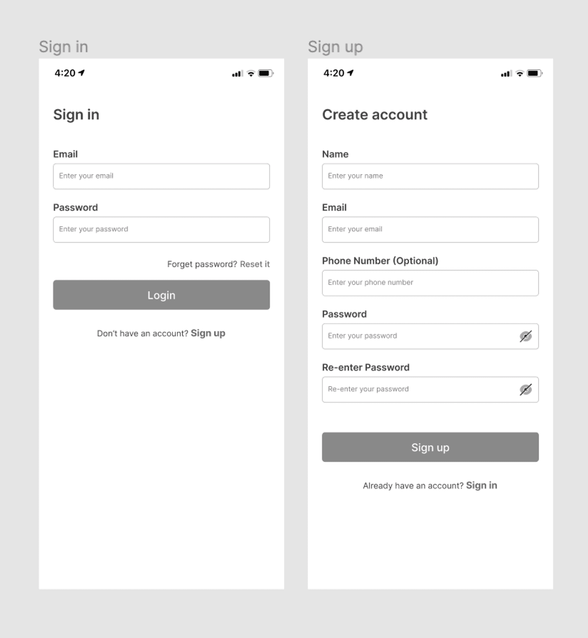
Onboarding Screens
A simple sign-in and sign-up page, after which users will have the option to choose whether to link their bank/card or input transactions manually, this can be changed later under settings.

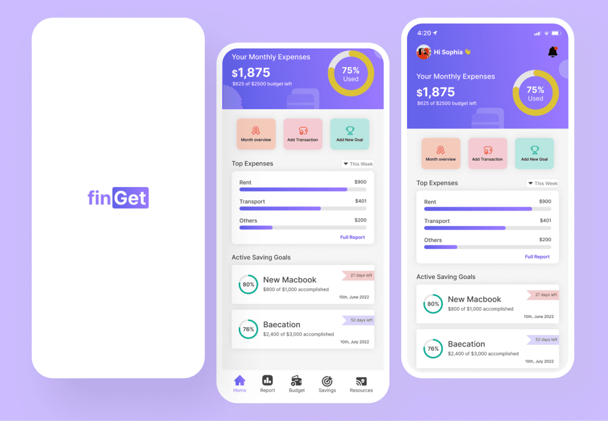
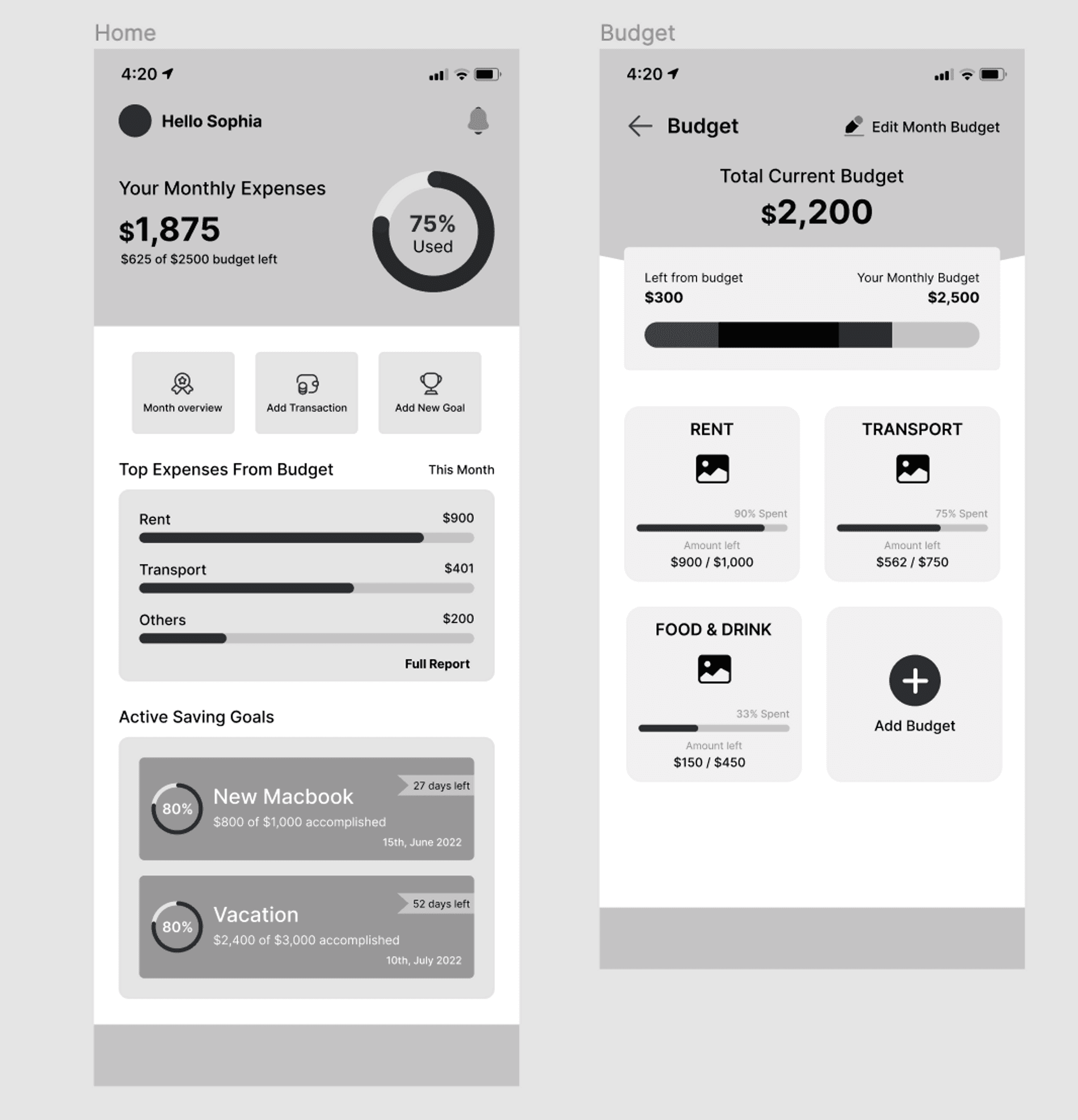
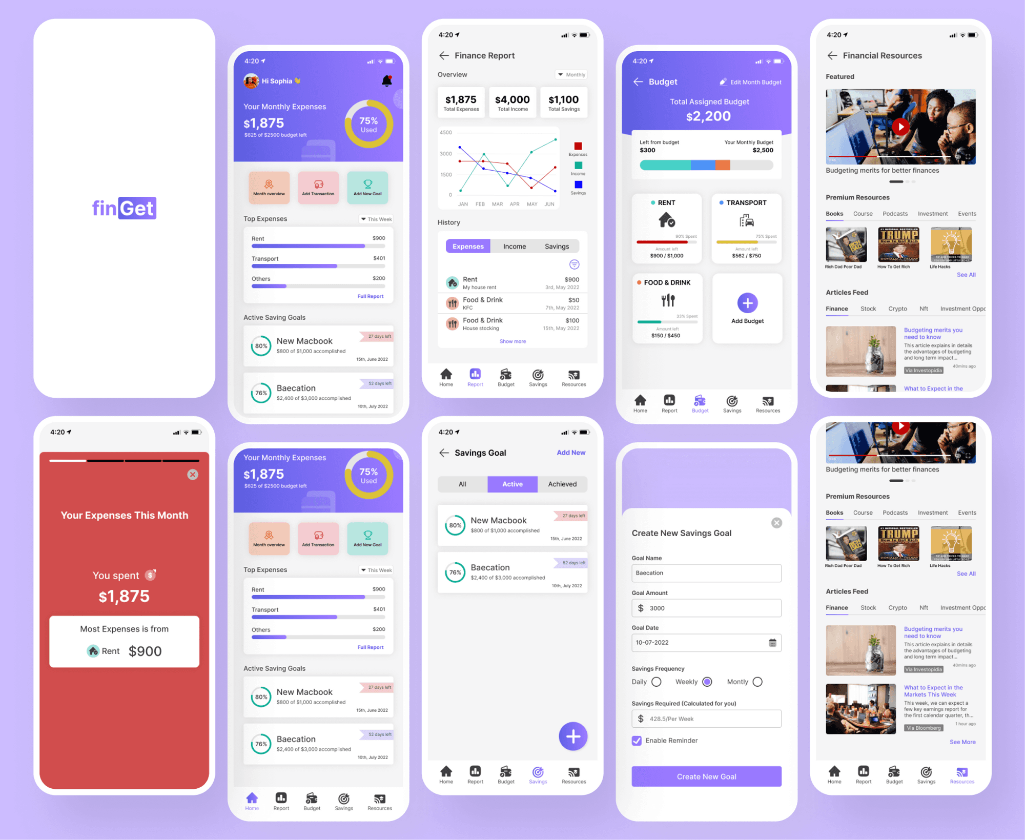
Home Dashboard Screens
Homepage versions are based on the user’s selection. Users will see their total monthly expenses, and the percentage of that to their budget set, the bar color changes based on the % (green, yellow, red). Also, users will see their top expenses and active savings goals. Options to open the full scope of their finances and easy navigation to other pages using the navigation menu. There are also 3 buttons to perform quick actions, including “Month overview” features, as shown below.
Financial snapshot Screens
An engaging feature to enable users to view their finances with snapshots of their monthly expenses, budget, income, and goals. This feature mimics social media status feature in order to enable an engaging experience and make the users feels as if they are using social media.

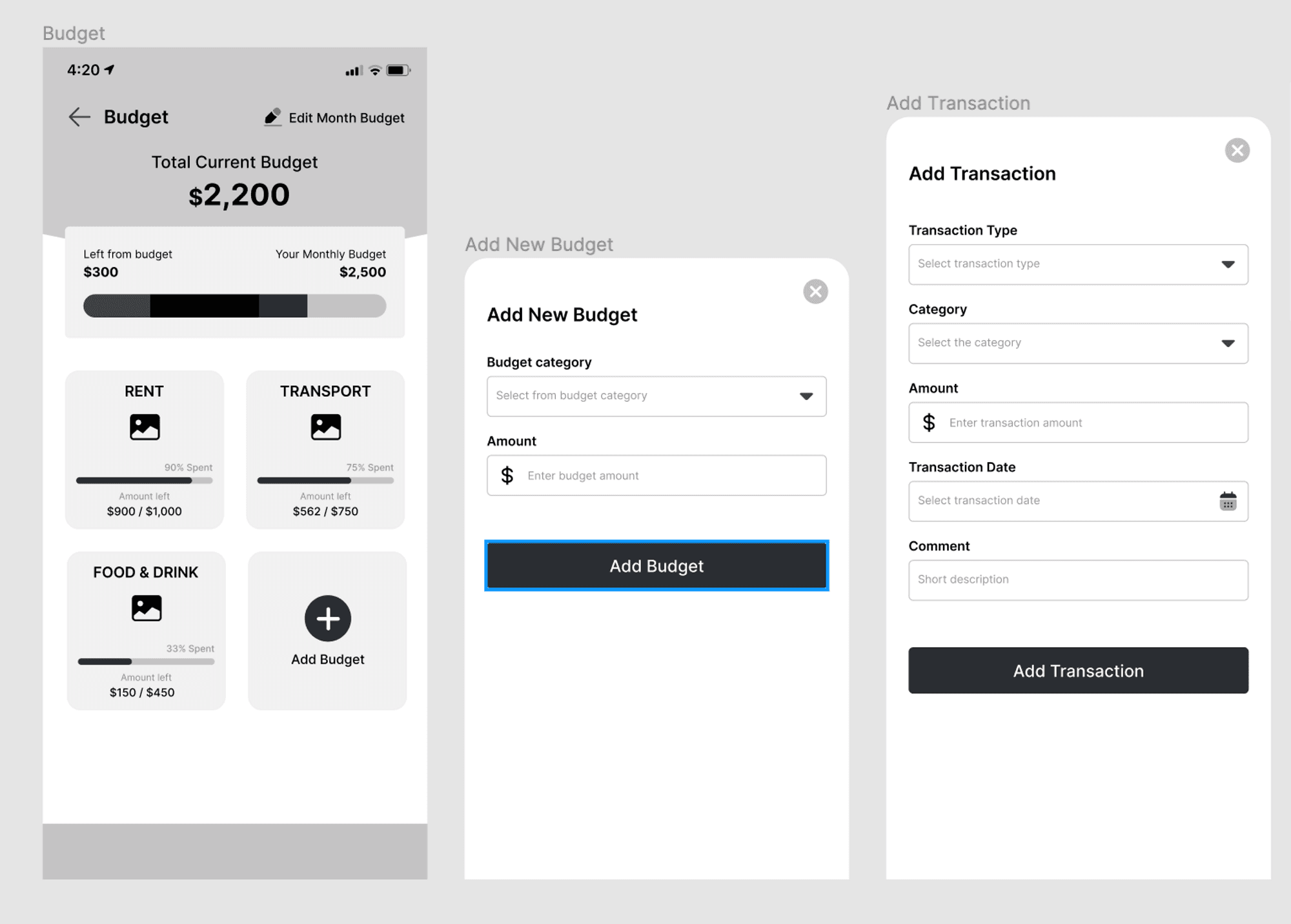
Budget Screens
Users can create budgeting plans for different categories out of their monthly budget set (users can easily change this as well). Users will see their budget plans including how much was spent on each and what’s left of it. The total assigned out of the total budget available is shown to help users understand how to manage and create budget plans. The top bar chart communicates the total monthly budget and how much is assigned to the budget category(each category has its assigned color), while the progress bar on each budget category card shows the expenses progress(the bar color changes based on expenses percentage, green, yellow, red).

Financial Report and Notification Screens
Users would be able to select from a variety of graphic reports to view their finances.
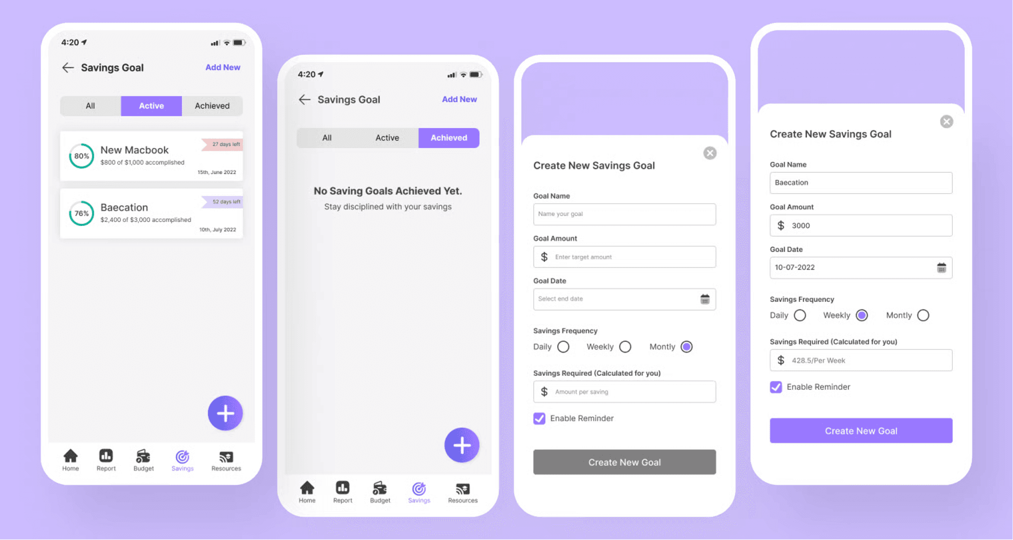
Savings Goal Screens
Users will create savings goals, track their progress, and have reminders for due dates.
Financial Resources Screens
Users will have access to premium and free financial resources, curated for them.

PROJECT BRIEF
Our users were experiencing issue with managing their finances and found it even difficult to budget and save and this was due to lack of a platform to trust with their data and information. They also experienced some frustration with the complexity of financial platforms which make it difficult for them to understand because of the text heaviness of those platforms, thus reducing their engagement on such platforms which in turn has a negative impact on their financial literacy.
💡 We had an overarching question throughout this project which was:
How might explore how to improve Financial Literacy
GOALS
Create a Fintech mobile application that streamlines a user’s financial process to help them reach their goals with ease. This application will simplify the user’s experience through the use of visualization and less text, and create an engaging experience with an interface similar to popular social media applications. Users will also have the option to link their bank to the app or decide to manually input their transactions, removing the challenge users face with security.
THE PROBLEM
Adulting is hard. As a young adult, learning to manage your finances, create a budget, and saving plan is harder. According to 42% of our users, nothing is harder than finding an app that makes this process simple, entertaining, and also makes them feel secure. Even users with an Intermediate level of experience with financial literacy report not knowing where to find financial resources, to expand upon what they currently know.
MY ROLE
I functioned as the Product designer and UX researcher in the team, 1 ux researcher, a product manager and 1 Front end engineer, 1 Backend engineers. I was responsible for user research, Information architecture, wireframing and high fidelity prototyping, usability testing.
TIMELINE
4 Weeks
RESEARCH SUMMARY
We conducted secondary research to learn more about financial literacy and surveyed 69 adults between the ages of 18-35 to determine the pain points of young adults understanding their experience in accessing financial literacy, their goals, and motivations. Open-ended questions allowed us to discover a lot about our users. Link to Survey Research
The goal was to design a product that is easy to use and addresses frustrations that arise from using existing solutions, this way the product can truly stand out of out of competition. To achieve this we used the Double Diamond Model to explore issues divergently (exploring in an open manner) and convergently (taking more focused actions).
MAPPING OUT THEIR EMOTIONS
IDENTIFYING THE USERS
PAINPOINT
Budgeting: User's want to find ways to budget, track expenses and save, but often need reminders.
Security/Consistency: User's can't seem to find an app they can trust with their financial information.
Lack of awareness: There are too many apps out today and they have no clue which apps to trust to learn more about financial literacy.
Complexity: User's are unable to digest apps that are too "wordy." Their time is limited and they need the information to be digestible and fast.
DESIGNS
The design objective was to utilize the UX research to foster simplicity and ease of use of the app. The user flow map paved the way for the first iteration of sketches, I was able to sketch all my ideas for the app experience and tried to translate it to content and the main tasks on the screens.
APP FLOW
A breakdown of the user journey when interacting with the application. The framework focuses only on the functionality behaviour and content of the app
FIRST APPROACH TO THE SOLUTION
We did the Crazy 8's sketching and "How Might We" exercise to come up with the best possible solutions for our design. The paper sketches were drawn after the Userflow was created.
LOW-FIDELITY DESIGNS
Onboarding Screens
Home Dashboard Screens
Savings Goals Screens
Budget Screens
Financial Report and Notification Screens
DESIGN SYSTEM
HIGH-FIDELITY DESIGNS
Onboarding Screens
A simple sign-in and sign-up page, after which users will have the option to choose whether to link their bank/card or input transactions manually, this can be changed later under settings.
Home Dashboard Screens
Homepage versions are based on the user’s selection. Users will see their total monthly expenses, and the percentage of that to their budget set, the bar color changes based on the % (green, yellow, red). Also, users will see their top expenses and active savings goals. Options to open the full scope of their finances and easy navigation to other pages using the navigation menu. There are also 3 buttons to perform quick actions, including “Month overview” features, as shown below.
Financial snapshot Screens
An engaging feature to enable users to view their finances with snapshots of their monthly expenses, budget, income, and goals. This feature mimics social media status feature in order to enable an engaging experience and make the users feels as if they are using social media.
Budget Screens
Users can create budgeting plans for different categories out of their monthly budget set (users can easily change this as well). Users will see their budget plans including how much was spent on each and what’s left of it. The total assigned out of the total budget available is shown to help users understand how to manage and create budget plans. The top bar chart communicates the total monthly budget and how much is assigned to the budget category(each category has its assigned color), while the progress bar on each budget category card shows the expenses progress(the bar color changes based on expenses percentage, green, yellow, red).
Financial Report and Notification Screens
Users would be able to select from a variety of graphic reports to view their finances.
Savings Goal Screens
Users will create savings goals, track their progress, and have reminders for due dates.
Financial Resources Screens
Users will have access to premium and free financial resources, curated for them.
Next Steps Conduct usability testing to see if our design addressed pain points Due to the time constraints of this project, we couldn’t conduct usability testing at the time, we would love to find out; (1) if the users find the app easy to use and navigate (2) If users are able to carry out tasks effectively and (3) if the solution addressed their pain points. Iterate design based on usability testing insights. Takeaway We had to choose our research method carefully because of time limitation and constraint. I was able to learn a lot about the Fintech industry and financial literacy in general. Designing for accessibility benefits all as it builds inclusion of all sort of people
I specialize in crafting exceptional digital experiences to help businesses achieve their goals.
Designed by Emmanuel Olubodun
I specialize in crafting exceptional digital experiences to help businesses achieve their goals.
Designed by Emmanuel Olubodun
I specialize in crafting exceptional digital experiences to help businesses achieve their goals.
Designed by Emmanuel Olubodun