Coordinex
A Productivity and Organization Software for Project and Task management
This project entails designing a tool that helps people stay organized and productive in the professional settings in a way that matters to them.
Project
Coordinex
Services
User Research UX Design UI Design
Industries
B2B/B2C Saas
Tools
Figma Miro Jira

Target Population
Our target population are young professionals who are engrossed with their work and need a way to manage projects, tasks, meetings, stay organized and productive.
My Role
I was the Primary Product designer and User experience researcher for this project. I worked collaboratively with the product management for requirement gathering and aligning business needs with user needs.
The Team
1 Product Designer and UX researcher (Me) 👨🏾🎨
1 Product Manager 👷👷👨🏾🕰📞
2 Front End Developer 👩🏽💻👨
2 Backend Developer 👨🏿💻
Timeline
2 Months
Problem Description
The organizational culture is a complete mayhem right now and without quality organizational or productivity tools, you’ll be lost in a black hole. It will consume all of your energy if you let it without ever thanking you for it.
Addressing The Problem
Coordinex is a tool we are proposing to address the problem. It would help people stay organized and productive in a way that matters to them. The key users of coordinex are professionals who are encumbered with work and are finding it difficult to stay organized in the workspace.
Coordinex would support the following high-end activities to enable users to achieve their goals:
Task management
Project management
Time management
Meeting management
Collaborations
Integrations with other tools for file sharing
Calendar view to plan and strategize projects
Research And Design Methods
For this project, I performed user interviews; in this process I created an interview protocols that enabled me to gather valuable insights from the users.
The insights gathered were synthesized using the affinity wall methodology and translated into personas, scenarios, story boards, functional requirements which are process artefacts that enabled me to move forward in this project.
I also created wireframes that were tested with four participants which enabled me to gather feedback from the users.

Key Needs Findings
After interviewing five participants, I proceeded to synthesize the data using the affinity diagramming methodology. During the needs finding analysis, several findings were uncovered based on participants' current practices and their desired needs. These findings include:
Tasks status is updated manually on the system by dragging from outstanding to ongoing to done to reviewed
People need to be able to set reminder, set tasks and itemize their work
There is need for web and mobile compatibility
The system only allows for one person to be assigned to a task at a time
The system currently in use, is not easy to understand and their files and emails are clustered making it uneasy to prioritize
Task review, documentation; file sharing are not together integrated with one system and they need authorization to access files
People block their calendar by setting up meetings with themselves to get focus time, and formatting text and recognizing icons is not easy
Moving from one interface to another is not easy and poor internet connection hinders sharing files with team
People need the system for collaboration, managing tasks, meetings, leads and incidents but they experience glitches with the system which makes them lose unsaved files
A lot of people’s work involve presenting and creating data validation but they have to start from scratch since there are no templates to use or autocomplete feature
People need integrations with emails, zoom, file share, AI tech and slack.
Users Current Practices
Users currently copy content from note app to paste on whatsapp to team because the file cannot be shared directly as a note file
User assign one person to a task but wish to be able to assign more than one person to a task at a time
People set up meetings with themselves to be able to find focus time
To set reminder, people use the reminder app, and the note app on their phone to
itemize their work
Users emails and files can be clustered and they have to manually sort by themselve
based on the priority and importance
When updating status, users have to manually update the status depending on the stage
they are on the task.
When users experience glitches with the system, they have to restart their computer,
thereby losing their unsaved files in the process
A lot of people’s work requires them doing presentations, creating data validation,
managing tasks, meetings, incidents but they usually start from scratch since they have
no template to build upon
Users use whatsapp to set up meetings and communicate with the team
Functional Requirements
These are the criteria the system design must accomplish in order to satisfy the users’ needs
Users should be able to manually update the status of their tasks and also have the ability to choose automatic update control to their tasks based on time estimation to complete the tasks
The system should enable users set reminders, set tasks and itemize their work
The system should enable multiple users to collaborate on a single task in real time
The system should allow for task review, file sharing, and documentation all integrated on the system.
The system should have authorization features by generating a unique code or letting the recipient of a file use their surname to access a file.
The system should enable users set focus time for productivity while notifying other team members about it
The product should allow easy text formatting with recognizable icons
The system should let users schedule meetings, manage tasks, and collaborate effectively
There should be autosave feature present to prevent users from losing unsaved files
There should be templates present and autocomplete feature
The system should have a seamless integration with Zoom, File share, Slack and AI such that it can be used on the system without taking them out of their journey
Constraints
These are the things that the system design should avoid in order to work well and be accepted by our target users
Not having a solid help and documentation during times when there is system glitch
Having limit of one person assigned to a task
Not having a proper icon labeling and text formatting
Not having autosave feature
Not having a template
Competitive Analysis
Five direct competitors were analyzed to find opportunities for differentiation and what the best practices suggest. You can find a link to the spreadsheet of the details analysis below:
https://docs.google.com/spreadsheets/d/18baLqupCouDbKkfoDKxY-QWYHvSBuzLoQPlVvv42kmw/edit?usp=sharing
Design Goal
The design would support the following high-end activities to enable users to achieve their goals:
Task management
Project management
Time management
Meeting management
Collaborations
Integrations with other tools for file sharing
Calendar view to plan and strategize projects
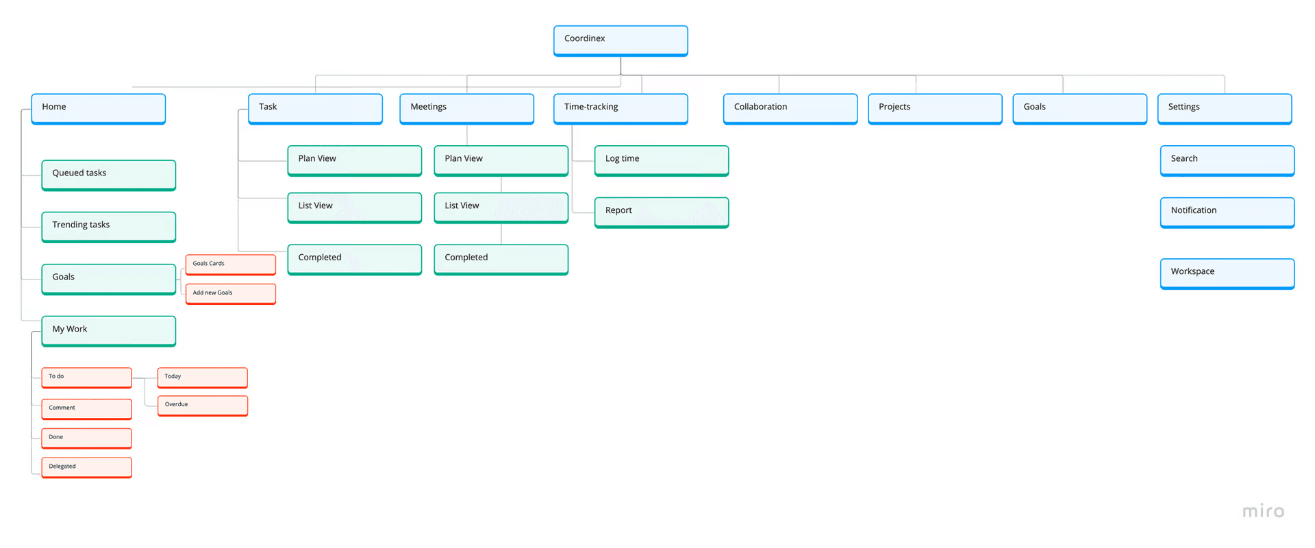
Information Architecture
Based on the research conducted and the needs of the users, information was laid out in the application in the hierarchy of importance. Below is the information architecture for the application that was agreed upon by the team.
First Approach To the Solution
Here is a sketch of some of the key screens that were tested with users.
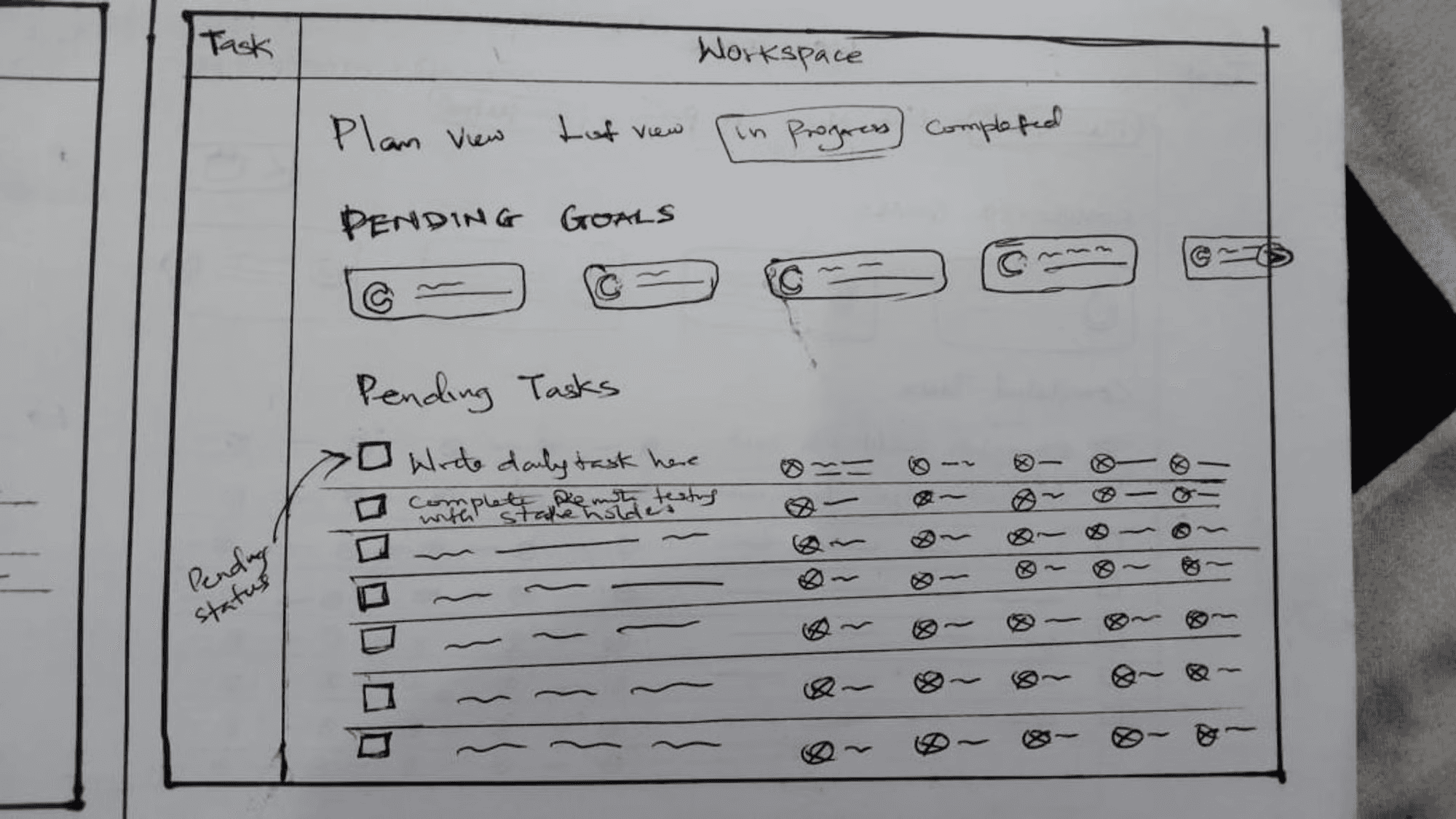

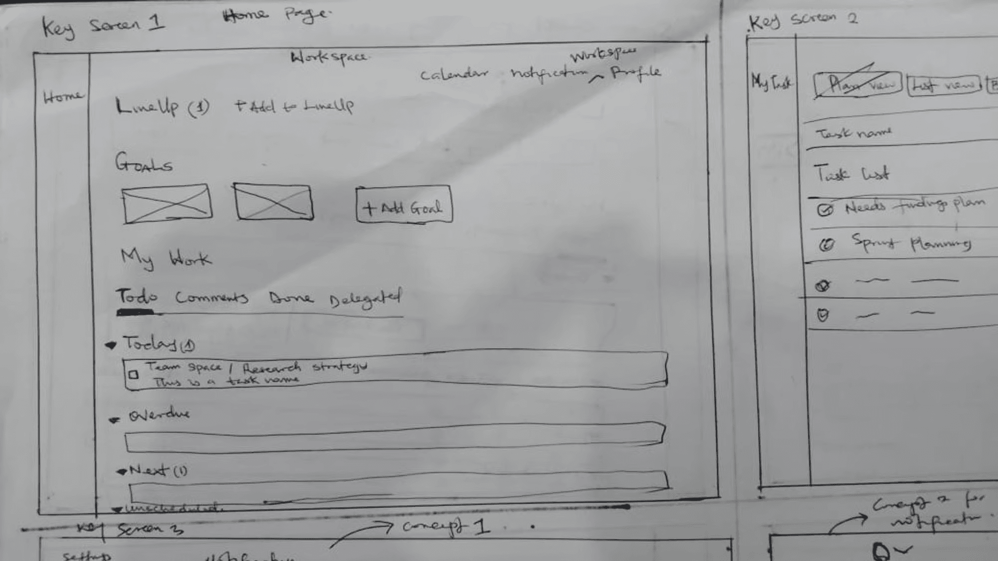
Med-Fi Prototypes
Key Task: These are the key tasks that users can perform with the designs
Task management
Meeting management
Calendar view to plan and strategize projects
Project management
Integrations with other tools for file sharing
Time management
Collaborations


Usability Test
GOAL
The test is designed to validate the main purpose of the project which is: “Designing a web application for people to be more productive and organized in the work place ” In this test we test two flows; to add a new task, and to add a new meeting and access task and meetings in the calendar
Test Participants:
The test includes 3 people belong to the following three categories:
1. Two senior users working in the tech industry and have a lot of backlogs, deliverables and meetings to deal with hence needing ways to manage tasks and meetings
2. one junior user working as a freelancer and just needs ways to manage tasks more efficiently
PROCESS
The test uses lo-fi prototype that was made by white paper, ruler, and a pencil. The prototype includes two papers, one for simulating a web application for users to add a new task based on the information on the interface, other papers are used to simulate different screens in the flow but for adding a new meeting and tracking it in their calendar. ways. Then users will be asked about their experience in the two methodologies, however, as the file indexing using Dropbox is new, the focus will be on it.
The prototypes were provided remotely and users were asked to complete each task given, and I took the test recording using a screen recorder and analyzed my findings based on the feedback from the test. This enabled me to address the critical incidents discovered.
USER TEST SCRIPTS
🗒️Thank you so much for accepting to perform this test. For today’s test we are going to test two flows that are used to manage tasks and meetings, and one flow that is used for tracking each task and meetings on the calendar.We are going to try four scenarios:
Scenario 1: Creating a new task.
Scenario 2: Creating a new meeting.
Scenario 3: Setting up your notifications.
Scenario 4: finding tasks and meetings on the calendar.
Before we start with the scenarios I’m going to start with warming questions:
1. What is your age class: 1.1. 15 - 24 1.2. 25 - 34 1.3. 35 - 45 1.4. Above 45
2. How many years of experience do you have in managing tasks and meetings?
3. How many years of experience do you have in managing settings on an application?
4. Have you ever used a productivity tool ?
5. If yes, have you found them effective?
6. Do you usually have interrupts in internet connection that affect performing your daily tasks?
6.1. If yes, how much monthly budget would you allocate to overcome this problem?
We are going to execute scenario 1 and 2 together and scenario 3 and 4 together as well asking each participant the following follow-up questions:
1. Would you accept using a system that uses the techniques mentioned in scenario 1 and 2 in your daily work?
1.1. Please elaborate.
2. On a scale of 1 to 10, one is hard and 10 is easy. How do you rate the simplicity of a) creating a new task scenario 1, and b) creating a new meeting in scenario 2?
3. If you think of three changes that would make creating a new task in 1 scenario 1 easier, what are they?
4. If you think of three changes that would make creating a new meeting in 1 scenario 2 easier, what are they?
Asking each participant to fill SUS (System Usability Scale) survey for scenario 1 and 2 combined, and another SUS for scenario 3 and 4 combined.
RESULTS
Finding 1: The quick Button for quick activation of the function “Add task” is confusing when the take the action to traverse to other screen.
Severity: 4/4
While performing task #1 “Create a new Task”, only two participants could do it, the rest of the participants didn’t know where to traverse to after clicking the “Create Task” button. Some of the participants were expecting to create new task and assign it to a team member which was outside the scope of the test.
Recommendations: Improve the design of the “assign task” input field by stating clearly that it’s an optional action. Also the design should enable the user know that they can assign the task later on whenever they want, even after creating the task.
Finding 2: It is difficult for users to interpret the table and traverse to another screen from it.
Severity: 3/4
For the task #1 “Add meeting”, participants found it easy to “Add meeting, but when they were on it, they couldn’t understand very well the information provided. Participants couldn’t recognize what areas were marked as Change priority, and also add locations were not clear to them. Additionally, they were looking for the function “Search” which wasn’t included in the prototype.
Recommendation: Add the function “Search”, redesign the tables making the add location explanatory and change priority easy.
Finding 3: The labels of some functions and buttons are not clear.
Severity: 2/4
Even though participants could perform two of the four tasks, they considered that some labels are not clear or could be improved. Specifically, they considered that the option “view calendar” should be called “Calendar”, because the Calendar icon was self explanatory.
Recommendation: Remove the View Calendar text and leave just the calendar icon as a floating action button
High-Fidelity Prototypes
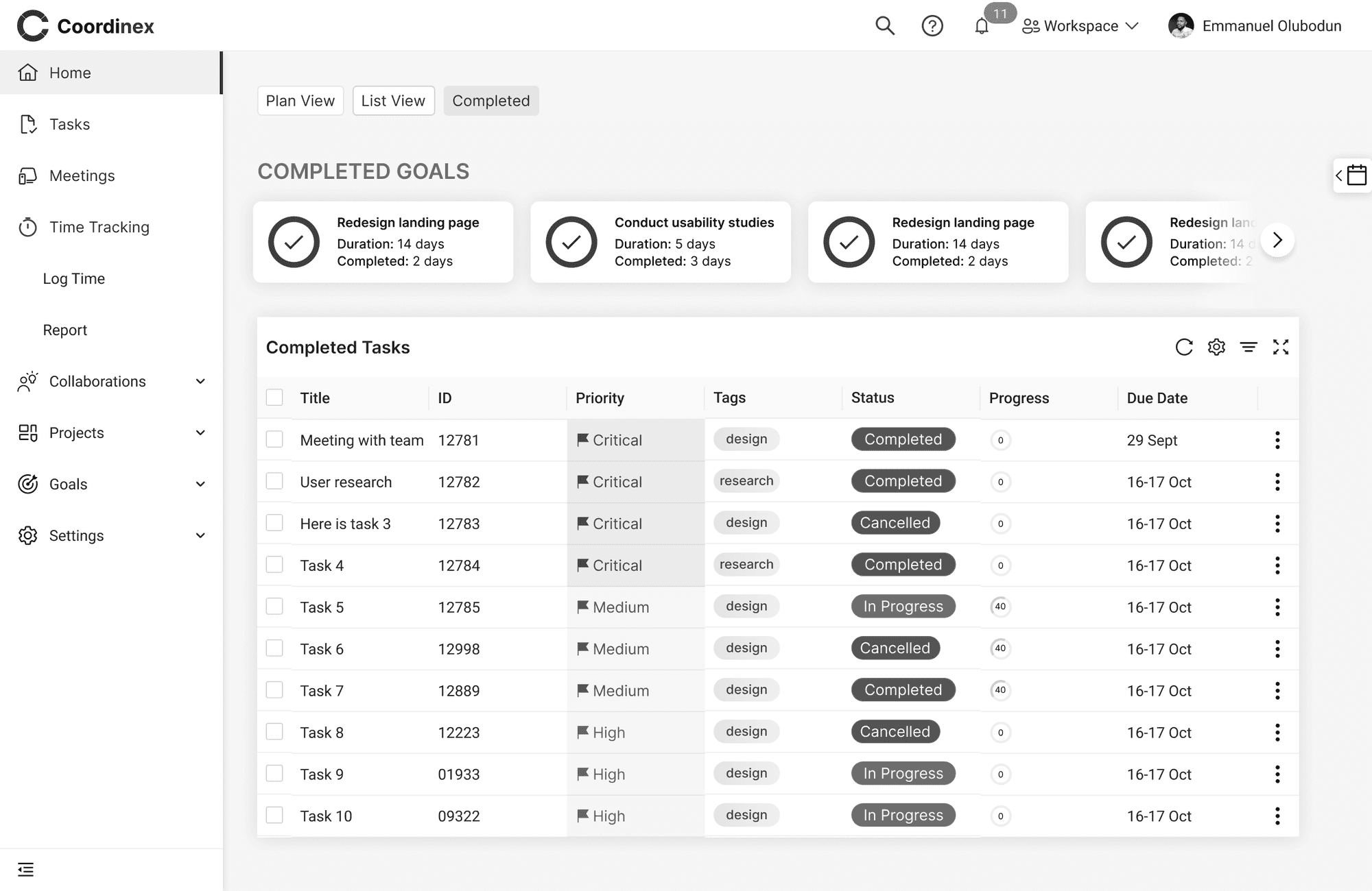
Home Screen: This home screen shows the queued task so that users can easily complete the pending high priority tasks. They can also see their goals and the current progress on each goals. They can also add new goals if they want. In the “My work section, it shows their current tasks, which of the tasks has been delegated and which of the tasks have been completed. Also the priority of the current tasks can be changed and the status of the tasks can be changed.
Task Screen: This is one of the key navigation screens and it displays the lists of the tasks in either “plan view” or “list view” allowing user to toggle through the tab feature. Also they can add new task which displays a dialogue modal upon taking the action.

Completed Tasks Screen: When users toggle on the completed task tab, this is the screen that displays. It shows the completed goals alongside so that they can be aware of the goals they have completed thus far.

Goal Progress Modal: Users can see the progress of their goals when they click on the goal. A modal is displayed, detailing the goal, and the progress (in percentage %), which can manually adjust based on how far they have gone with the goal.

Add Task Modal: When user want to create a new task, a small modal appears based on the current needs of the users. If the users needs to input more details about the task, they can expand the modal by clicking on the “show more” option. This will enable the input the task details

Calendar Overlay Feature: The calendar feature is placed as a floating action button such that when clicked, it overlays on the screen, enabling the user have flexible access to their calendar and the task in their calendar.

Top Navigation Dropdown: The top navigation has some important menus such as
Workspace: Here, upon clicking the workspace, the drop down appears showing the user’s current workspace and giving the user the flexibility of adding a new workspace or renaming their current workspace.
User’s Profile: The user can access their profile by clicking on the avatar feature which displays a dropdown menu. Here they can toggle the display theme and change to either dark or light mode, or take other actions displayed to them based on their needs.


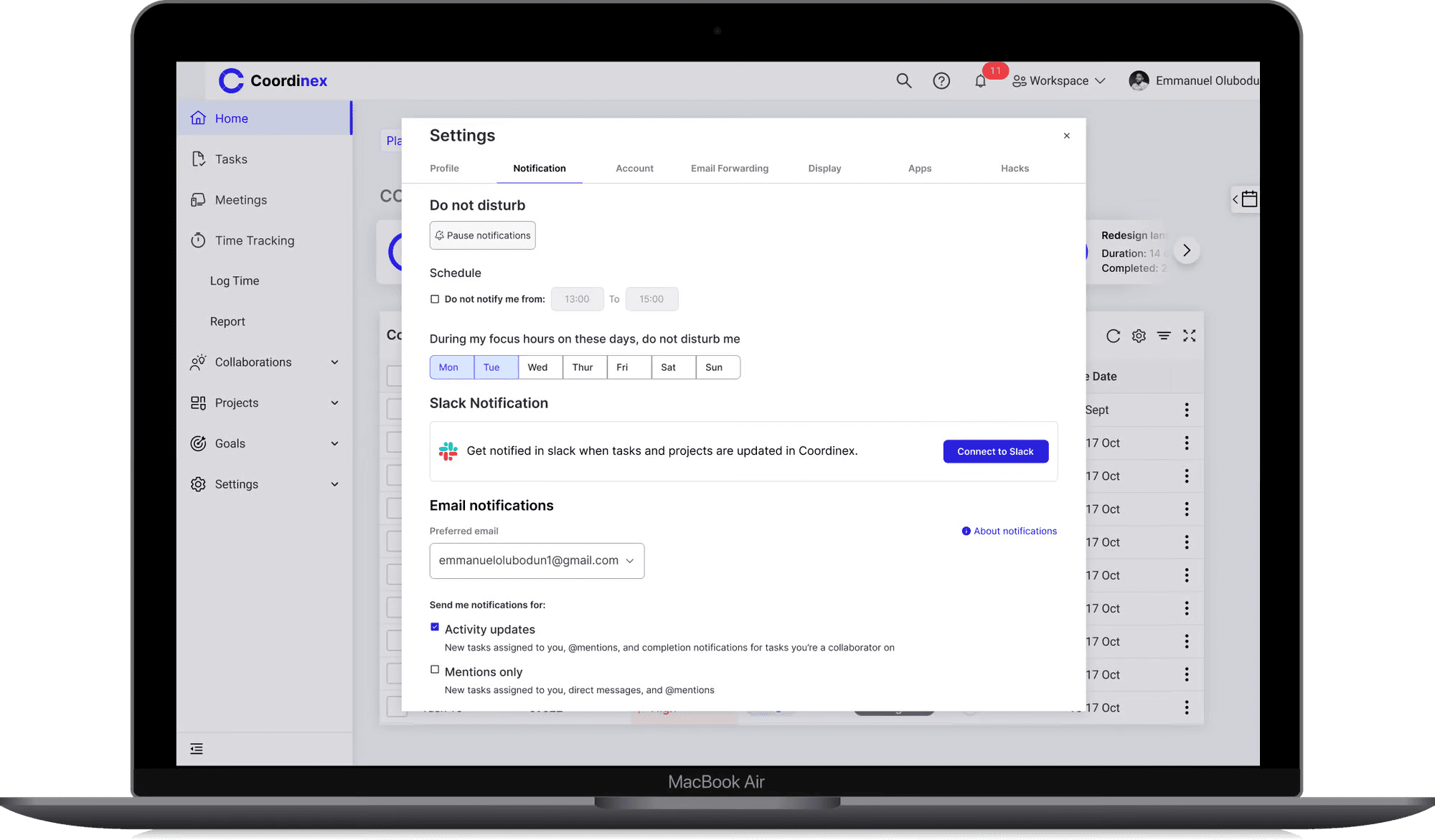
Notification Settings: Sometimes, users need their focus time and want to be able to pause their notification to avoid distraction. This feature gives them that flexibility where they can pause their notifications for some hours and even configure it further. Upon clicking on “Configure Notification Settings” a large Dialogue appear giving them even more flexibility to their notification settings. Also, they can integrate other third party applications such as, Slack on their account.
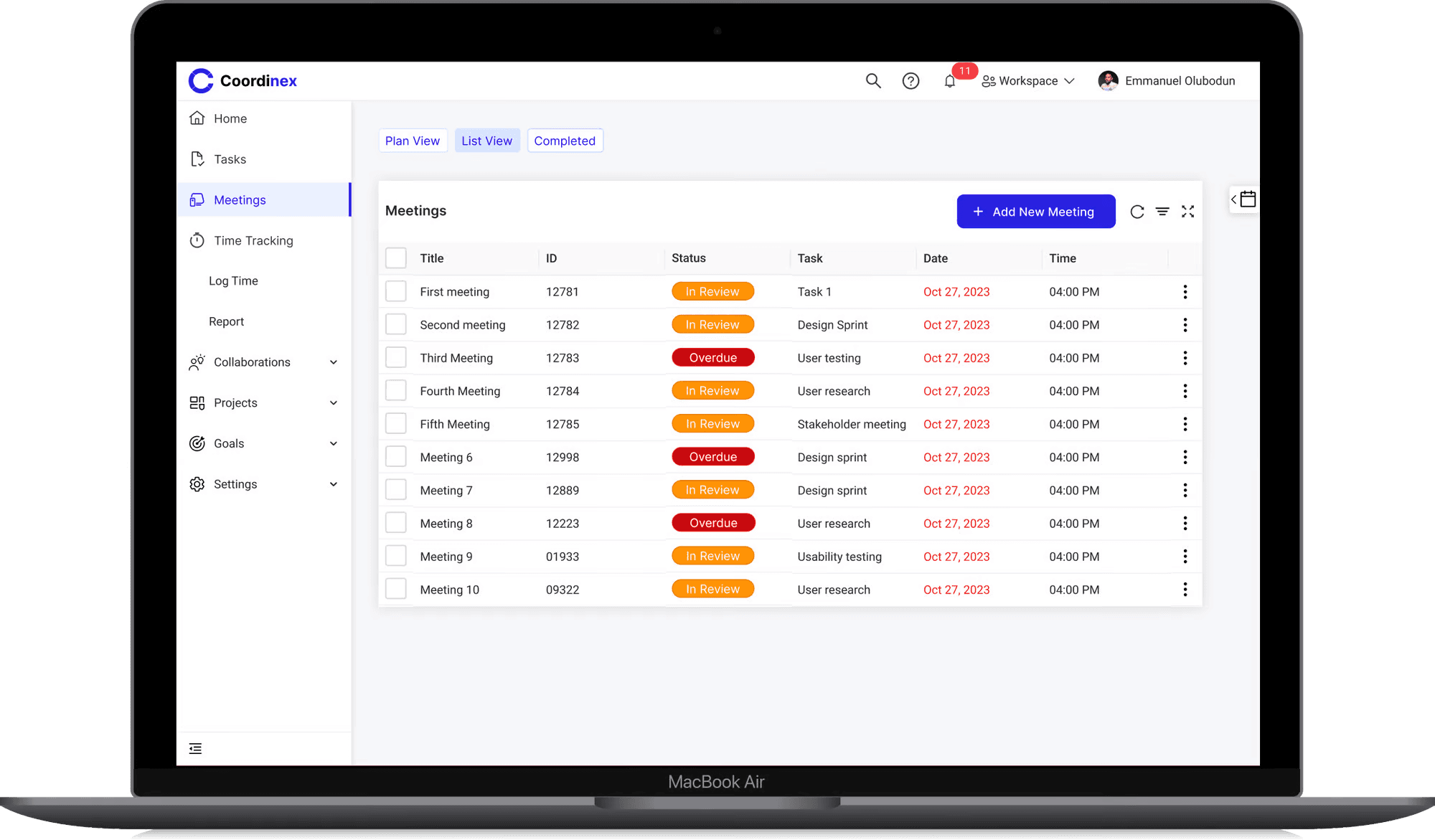
Meetings Screen: The meeting screen is another key navigation screen that shows the meetings that has been created by the user. This enables the user keep track of their meeting without missing out
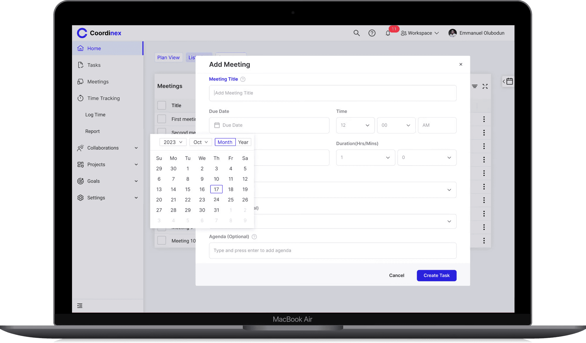
Add Meeting Screen: When the user clicks on “Add New Meeting” a dialogue modal displays where they can input the details of the meeting, set the date and time.
Next Steps
As we embark on this pivotal phase with our inaugural Minimum Viable Product (MVP), I am committed to delving deeper into comprehensive research. The aim is to ensure that we not only meet but exceed the needs of the majority of our users. To achieve this, I will be conducting further usability studies to unearth critical insights that will contribute to refining and enhancing our product.
Additionally, it is imperative to highlight that the MVP is now transitioning into the capable hands of our engineering team. The handoff signifies a significant milestone in our journey, marking the beginning of the iterative process that will shape our product into a robust solution that truly resonates with our users.
Appendix
Personas:

Target Population
Our target population are young professionals who are engrossed with their work and need a way to manage projects, tasks, meetings, stay organized and productive.
My Role
I was the Primary Product designer and User experience researcher for this project. I worked collaboratively with the product management for requirement gathering and aligning business needs with user needs.
The Team
1 Product Designer and UX researcher (Me) 👨🏾🎨
1 Product Manager 👷👷👨🏾🕰📞
2 Front End Developer 👩🏽💻👨
2 Backend Developer 👨🏿💻
Timeline
2 Months
Problem Description
The organizational culture is a complete mayhem right now and without quality organizational or productivity tools, you’ll be lost in a black hole. It will consume all of your energy if you let it without ever thanking you for it.
Addressing The Problem
Coordinex is a tool we are proposing to address the problem. It would help people stay organized and productive in a way that matters to them. The key users of coordinex are professionals who are encumbered with work and are finding it difficult to stay organized in the workspace.
Coordinex would support the following high-end activities to enable users to achieve their goals:
Task management
Project management
Time management
Meeting management
Collaborations
Integrations with other tools for file sharing
Calendar view to plan and strategize projects
Research And Design Methods
For this project, I performed user interviews; in this process I created an interview protocols that enabled me to gather valuable insights from the users.
The insights gathered were synthesized using the affinity wall methodology and translated into personas, scenarios, story boards, functional requirements which are process artefacts that enabled me to move forward in this project.
I also created wireframes that were tested with four participants which enabled me to gather feedback from the users.
Key Needs Findings
After interviewing five participants, I proceeded to synthesize the data using the affinity diagramming methodology. During the needs finding analysis, several findings were uncovered based on participants' current practices and their desired needs. These findings include:
Tasks status is updated manually on the system by dragging from outstanding to ongoing to done to reviewed
People need to be able to set reminder, set tasks and itemize their work
There is need for web and mobile compatibility
The system only allows for one person to be assigned to a task at a time
The system currently in use, is not easy to understand and their files and emails are clustered making it uneasy to prioritize
Task review, documentation; file sharing are not together integrated with one system and they need authorization to access files
People block their calendar by setting up meetings with themselves to get focus time, and formatting text and recognizing icons is not easy
Moving from one interface to another is not easy and poor internet connection hinders sharing files with team
People need the system for collaboration, managing tasks, meetings, leads and incidents but they experience glitches with the system which makes them lose unsaved files
A lot of people’s work involve presenting and creating data validation but they have to start from scratch since there are no templates to use or autocomplete feature
People need integrations with emails, zoom, file share, AI tech and slack.
Users Current Practices
Users currently copy content from note app to paste on whatsapp to team because the file cannot be shared directly as a note file
User assign one person to a task but wish to be able to assign more than one person to a task at a time
People set up meetings with themselves to be able to find focus time
To set reminder, people use the reminder app, and the note app on their phone to
itemize their work
Users emails and files can be clustered and they have to manually sort by themselve
based on the priority and importance
When updating status, users have to manually update the status depending on the stage
they are on the task.
When users experience glitches with the system, they have to restart their computer,
thereby losing their unsaved files in the process
A lot of people’s work requires them doing presentations, creating data validation,
managing tasks, meetings, incidents but they usually start from scratch since they have
no template to build upon
Users use whatsapp to set up meetings and communicate with the team
Functional Requirements
These are the criteria the system design must accomplish in order to satisfy the users’ needs
Users should be able to manually update the status of their tasks and also have the ability to choose automatic update control to their tasks based on time estimation to complete the tasks
The system should enable users set reminders, set tasks and itemize their work
The system should enable multiple users to collaborate on a single task in real time
The system should allow for task review, file sharing, and documentation all integrated on the system.
The system should have authorization features by generating a unique code or letting the recipient of a file use their surname to access a file.
The system should enable users set focus time for productivity while notifying other team members about it
The product should allow easy text formatting with recognizable icons
The system should let users schedule meetings, manage tasks, and collaborate effectively
There should be autosave feature present to prevent users from losing unsaved files
There should be templates present and autocomplete feature
The system should have a seamless integration with Zoom, File share, Slack and AI such that it can be used on the system without taking them out of their journey
Constraints
These are the things that the system design should avoid in order to work well and be accepted by our target users
Not having a solid help and documentation during times when there is system glitch
Having limit of one person assigned to a task
Not having a proper icon labeling and text formatting
Not having autosave feature
Not having a template
Competitive Analysis
Five direct competitors were analyzed to find opportunities for differentiation and what the best practices suggest. You can find a link to the spreadsheet of the details analysis below:
https://docs.google.com/spreadsheets/d/18baLqupCouDbKkfoDKxY-QWYHvSBuzLoQPlVvv42kmw/edit?usp=sharing
Design Goal
The design would support the following high-end activities to enable users to achieve their goals:
Task management
Project management
Time management
Meeting management
Collaborations
Integrations with other tools for file sharing
Calendar view to plan and strategize projects
Information Architecture
Based on the research conducted and the needs of the users, information was laid out in the application in the hierarchy of importance. Below is the information architecture for the application that was agreed upon by the team.
First Approach To the Solution
Here is a sketch of some of the key screens that were tested with users.
Med-Fi Prototypes
Key Task: These are the key tasks that users can perform with the designs
Task management
Meeting management
Calendar view to plan and strategize projects
Project management
Integrations with other tools for file sharing
Time management
Collaborations
Usability Test
GOAL
The test is designed to validate the main purpose of the project which is: “Designing a web application for people to be more productive and organized in the work place ” In this test we test two flows; to add a new task, and to add a new meeting and access task and meetings in the calendar
Test Participants:
The test includes 3 people belong to the following three categories:
1. Two senior users working in the tech industry and have a lot of backlogs, deliverables and meetings to deal with hence needing ways to manage tasks and meetings
2. one junior user working as a freelancer and just needs ways to manage tasks more efficiently
PROCESS
The test uses lo-fi prototype that was made by white paper, ruler, and a pencil. The prototype includes two papers, one for simulating a web application for users to add a new task based on the information on the interface, other papers are used to simulate different screens in the flow but for adding a new meeting and tracking it in their calendar. ways. Then users will be asked about their experience in the two methodologies, however, as the file indexing using Dropbox is new, the focus will be on it.
The prototypes were provided remotely and users were asked to complete each task given, and I took the test recording using a screen recorder and analyzed my findings based on the feedback from the test. This enabled me to address the critical incidents discovered.
USER TEST SCRIPTS
🗒️Thank you so much for accepting to perform this test. For today’s test we are going to test two flows that are used to manage tasks and meetings, and one flow that is used for tracking each task and meetings on the calendar.We are going to try four scenarios:
Scenario 1: Creating a new task.
Scenario 2: Creating a new meeting.
Scenario 3: Setting up your notifications.
Scenario 4: finding tasks and meetings on the calendar.
Before we start with the scenarios I’m going to start with warming questions:
1. What is your age class: 1.1. 15 - 24 1.2. 25 - 34 1.3. 35 - 45 1.4. Above 45
2. How many years of experience do you have in managing tasks and meetings?
3. How many years of experience do you have in managing settings on an application?
4. Have you ever used a productivity tool ?
5. If yes, have you found them effective?
6. Do you usually have interrupts in internet connection that affect performing your daily tasks?
6.1. If yes, how much monthly budget would you allocate to overcome this problem?
We are going to execute scenario 1 and 2 together and scenario 3 and 4 together as well asking each participant the following follow-up questions:
1. Would you accept using a system that uses the techniques mentioned in scenario 1 and 2 in your daily work?
1.1. Please elaborate.
2. On a scale of 1 to 10, one is hard and 10 is easy. How do you rate the simplicity of a) creating a new task scenario 1, and b) creating a new meeting in scenario 2?
3. If you think of three changes that would make creating a new task in 1 scenario 1 easier, what are they?
4. If you think of three changes that would make creating a new meeting in 1 scenario 2 easier, what are they?
Asking each participant to fill SUS (System Usability Scale) survey for scenario 1 and 2 combined, and another SUS for scenario 3 and 4 combined.
RESULTS
Finding 1: The quick Button for quick activation of the function “Add task” is confusing when the take the action to traverse to other screen.
Severity: 4/4
While performing task #1 “Create a new Task”, only two participants could do it, the rest of the participants didn’t know where to traverse to after clicking the “Create Task” button. Some of the participants were expecting to create new task and assign it to a team member which was outside the scope of the test.
Recommendations: Improve the design of the “assign task” input field by stating clearly that it’s an optional action. Also the design should enable the user know that they can assign the task later on whenever they want, even after creating the task.
Finding 2: It is difficult for users to interpret the table and traverse to another screen from it.
Severity: 3/4
For the task #1 “Add meeting”, participants found it easy to “Add meeting, but when they were on it, they couldn’t understand very well the information provided. Participants couldn’t recognize what areas were marked as Change priority, and also add locations were not clear to them. Additionally, they were looking for the function “Search” which wasn’t included in the prototype.
Recommendation: Add the function “Search”, redesign the tables making the add location explanatory and change priority easy.
Finding 3: The labels of some functions and buttons are not clear.
Severity: 2/4
Even though participants could perform two of the four tasks, they considered that some labels are not clear or could be improved. Specifically, they considered that the option “view calendar” should be called “Calendar”, because the Calendar icon was self explanatory.
Recommendation: Remove the View Calendar text and leave just the calendar icon as a floating action button
High-Fidelity Prototypes
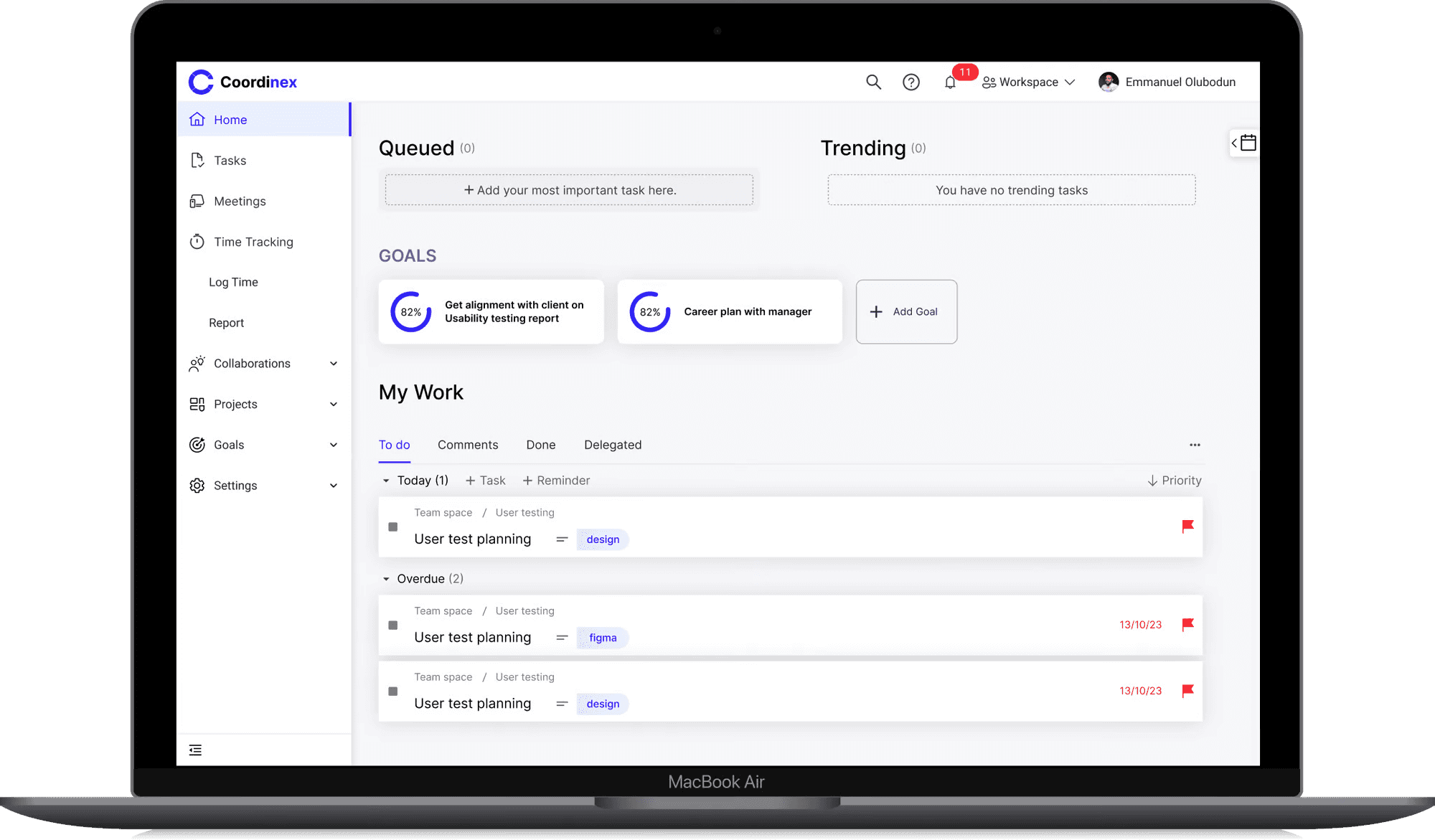
Home Screen: This home screen shows the queued task so that users can easily complete the pending high priority tasks. They can also see their goals and the current progress on each goals. They can also add new goals if they want. In the “My work section, it shows their current tasks, which of the tasks has been delegated and which of the tasks have been completed. Also the priority of the current tasks can be changed and the status of the tasks can be changed.
Task Screen: This is one of the key navigation screens and it displays the lists of the tasks in either “plan view” or “list view” allowing user to toggle through the tab feature. Also they can add new task which displays a dialogue modal upon taking the action.
Completed Tasks Screen: When users toggle on the completed task tab, this is the screen that displays. It shows the completed goals alongside so that they can be aware of the goals they have completed thus far.
Goal Progress Modal: Users can see the progress of their goals when they click on the goal. A modal is displayed, detailing the goal, and the progress (in percentage %), which can manually adjust based on how far they have gone with the goal.
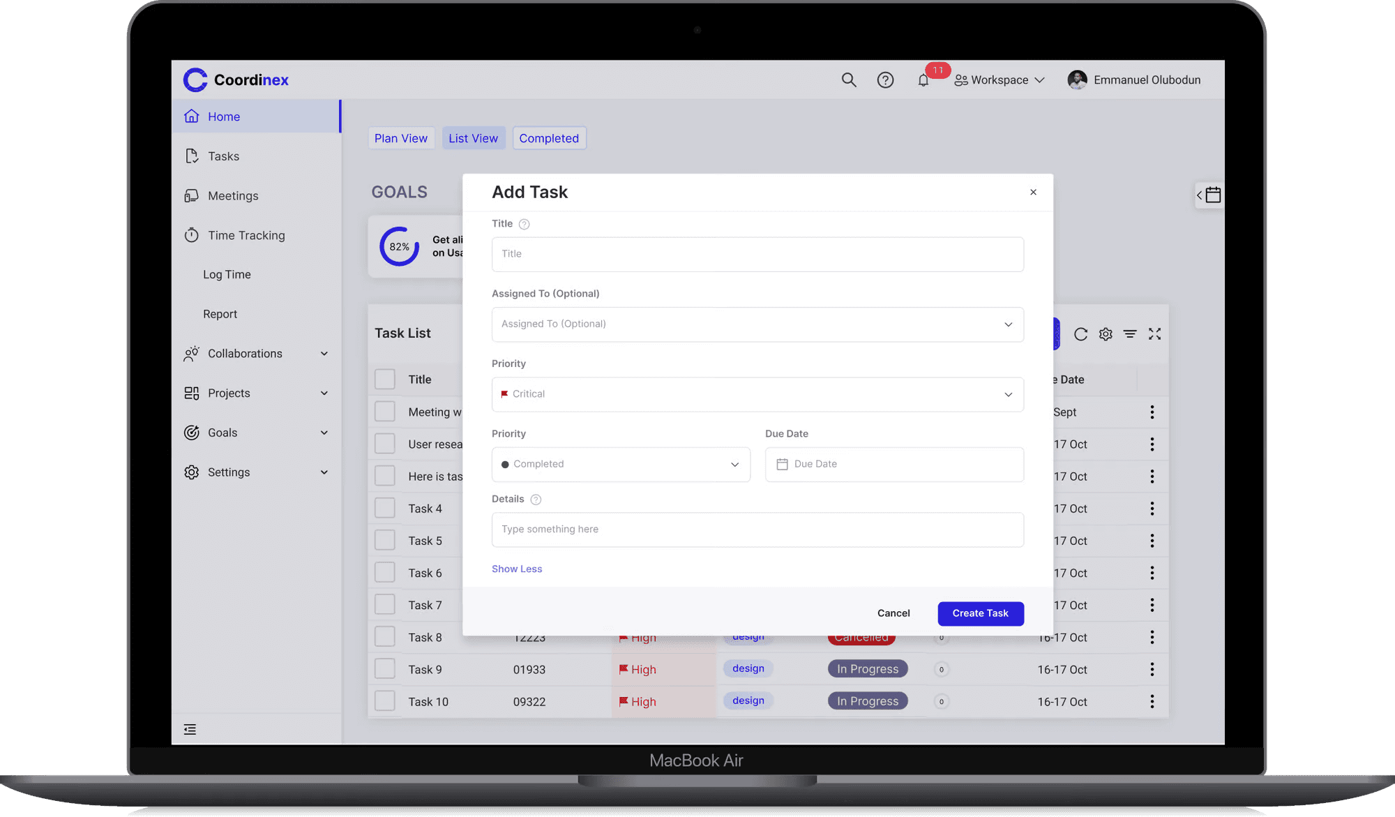
Add Task Modal: When user want to create a new task, a small modal appears based on the current needs of the users. If the users needs to input more details about the task, they can expand the modal by clicking on the “show more” option. This will enable the input the task details
Calendar Overlay Feature: The calendar feature is placed as a floating action button such that when clicked, it overlays on the screen, enabling the user have flexible access to their calendar and the task in their calendar.
Top Navigation Dropdown: The top navigation has some important menus such as
Workspace: Here, upon clicking the workspace, the drop down appears showing the user’s current workspace and giving the user the flexibility of adding a new workspace or renaming their current workspace.
User’s Profile: The user can access their profile by clicking on the avatar feature which displays a dropdown menu. Here they can toggle the display theme and change to either dark or light mode, or take other actions displayed to them based on their needs.
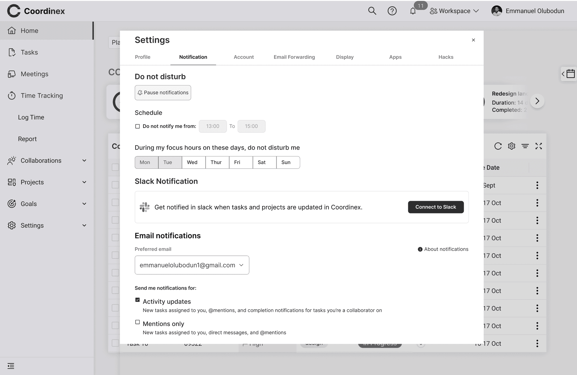
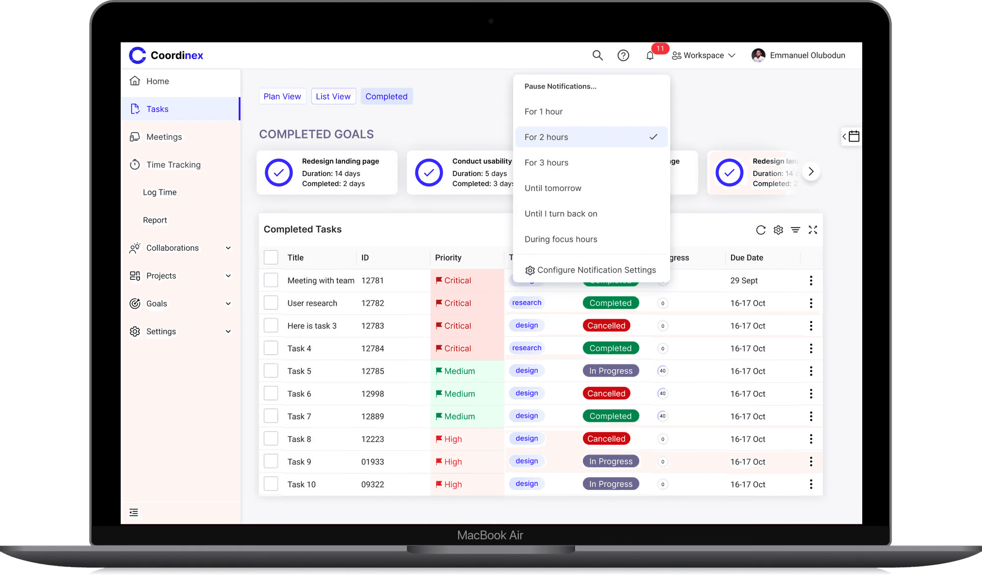
Notification Settings: Sometimes, users need their focus time and want to be able to pause their notification to avoid distraction. This feature gives them that flexibility where they can pause their notifications for some hours and even configure it further. Upon clicking on “Configure Notification Settings” a large Dialogue appear giving them even more flexibility to their notification settings. Also, they can integrate other third party applications such as, Slack on their account.
Meetings Screen: The meeting screen is another key navigation screen that shows the meetings that has been created by the user. This enables the user keep track of their meeting without missing out
Add Meeting Screen: When the user clicks on “Add New Meeting” a dialogue modal displays where they can input the details of the meeting, set the date and time.
Next Steps
As we embark on this pivotal phase with our inaugural Minimum Viable Product (MVP), I am committed to delving deeper into comprehensive research. The aim is to ensure that we not only meet but exceed the needs of the majority of our users. To achieve this, I will be conducting further usability studies to unearth critical insights that will contribute to refining and enhancing our product.
Additionally, it is imperative to highlight that the MVP is now transitioning into the capable hands of our engineering team. The handoff signifies a significant milestone in our journey, marking the beginning of the iterative process that will shape our product into a robust solution that truly resonates with our users.
Appendix
Personas:
Target Population
Our target population are young professionals who are engrossed with their work and need a way to manage projects, tasks, meetings, stay organized and productive.
My Role
I was the Primary Product designer and User experience researcher for this project. I worked collaboratively with the product management for requirement gathering and aligning business needs with user needs.
The Team
1 Product Designer and UX researcher (Me) 👨🏾🎨
1 Product Manager 👷👷👨🏾🕰📞
2 Front End Developer 👩🏽💻👨
2 Backend Developer 👨🏿💻
Timeline
2 Months
Problem Description
The organizational culture is a complete mayhem right now and without quality organizational or productivity tools, you’ll be lost in a black hole. It will consume all of your energy if you let it without ever thanking you for it.
Addressing The Problem
Coordinex is a tool we are proposing to address the problem. It would help people stay organized and productive in a way that matters to them. The key users of coordinex are professionals who are encumbered with work and are finding it difficult to stay organized in the workspace.
Coordinex would support the following high-end activities to enable users to achieve their goals:
Task management
Project management
Time management
Meeting management
Collaborations
Integrations with other tools for file sharing
Calendar view to plan and strategize projects
Research And Design Methods
For this project, I performed user interviews; in this process I created an interview protocols that enabled me to gather valuable insights from the users.
The insights gathered were synthesized using the affinity wall methodology and translated into personas, scenarios, story boards, functional requirements which are process artefacts that enabled me to move forward in this project.
I also created wireframes that were tested with four participants which enabled me to gather feedback from the users.
Key Needs Findings
After interviewing five participants, I proceeded to synthesize the data using the affinity diagramming methodology. During the needs finding analysis, several findings were uncovered based on participants' current practices and their desired needs. These findings include:
Tasks status is updated manually on the system by dragging from outstanding to ongoing to done to reviewed
People need to be able to set reminder, set tasks and itemize their work
There is need for web and mobile compatibility
The system only allows for one person to be assigned to a task at a time
The system currently in use, is not easy to understand and their files and emails are clustered making it uneasy to prioritize
Task review, documentation; file sharing are not together integrated with one system and they need authorization to access files
People block their calendar by setting up meetings with themselves to get focus time, and formatting text and recognizing icons is not easy
Moving from one interface to another is not easy and poor internet connection hinders sharing files with team
People need the system for collaboration, managing tasks, meetings, leads and incidents but they experience glitches with the system which makes them lose unsaved files
A lot of people’s work involve presenting and creating data validation but they have to start from scratch since there are no templates to use or autocomplete feature
People need integrations with emails, zoom, file share, AI tech and slack.
Users Current Practices
Users currently copy content from note app to paste on whatsapp to team because the file cannot be shared directly as a note file
User assign one person to a task but wish to be able to assign more than one person to a task at a time
People set up meetings with themselves to be able to find focus time
To set reminder, people use the reminder app, and the note app on their phone to
itemize their work
Users emails and files can be clustered and they have to manually sort by themselve
based on the priority and importance
When updating status, users have to manually update the status depending on the stage
they are on the task.
When users experience glitches with the system, they have to restart their computer,
thereby losing their unsaved files in the process
A lot of people’s work requires them doing presentations, creating data validation,
managing tasks, meetings, incidents but they usually start from scratch since they have
no template to build upon
Users use whatsapp to set up meetings and communicate with the team
Functional Requirements
These are the criteria the system design must accomplish in order to satisfy the users’ needs
Users should be able to manually update the status of their tasks and also have the ability to choose automatic update control to their tasks based on time estimation to complete the tasks
The system should enable users set reminders, set tasks and itemize their work
The system should enable multiple users to collaborate on a single task in real time
The system should allow for task review, file sharing, and documentation all integrated on the system.
The system should have authorization features by generating a unique code or letting the recipient of a file use their surname to access a file.
The system should enable users set focus time for productivity while notifying other team members about it
The product should allow easy text formatting with recognizable icons
The system should let users schedule meetings, manage tasks, and collaborate effectively
There should be autosave feature present to prevent users from losing unsaved files
There should be templates present and autocomplete feature
The system should have a seamless integration with Zoom, File share, Slack and AI such that it can be used on the system without taking them out of their journey
Constraints
These are the things that the system design should avoid in order to work well and be accepted by our target users
Not having a solid help and documentation during times when there is system glitch
Having limit of one person assigned to a task
Not having a proper icon labeling and text formatting
Not having autosave feature
Not having a template
Competitive Analysis
Five direct competitors were analyzed to find opportunities for differentiation and what the best practices suggest. You can find a link to the spreadsheet of the details analysis below:
https://docs.google.com/spreadsheets/d/18baLqupCouDbKkfoDKxY-QWYHvSBuzLoQPlVvv42kmw/edit?usp=sharing
Design Goal
The design would support the following high-end activities to enable users to achieve their goals:
Task management
Project management
Time management
Meeting management
Collaborations
Integrations with other tools for file sharing
Calendar view to plan and strategize projects
Information Architecture
Based on the research conducted and the needs of the users, information was laid out in the application in the hierarchy of importance. Below is the information architecture for the application that was agreed upon by the team.
First Approach To the Solution
Here is a sketch of some of the key screens that were tested with users.
Med-Fi Prototypes
Key Task: These are the key tasks that users can perform with the designs
Task management
Meeting management
Calendar view to plan and strategize projects
Project management
Integrations with other tools for file sharing
Time management
Collaborations
Usability Test
GOAL
The test is designed to validate the main purpose of the project which is: “Designing a web application for people to be more productive and organized in the work place ” In this test we test two flows; to add a new task, and to add a new meeting and access task and meetings in the calendar
Test Participants:
The test includes 3 people belong to the following three categories:
1. Two senior users working in the tech industry and have a lot of backlogs, deliverables and meetings to deal with hence needing ways to manage tasks and meetings
2. one junior user working as a freelancer and just needs ways to manage tasks more efficiently
PROCESS
The test uses lo-fi prototype that was made by white paper, ruler, and a pencil. The prototype includes two papers, one for simulating a web application for users to add a new task based on the information on the interface, other papers are used to simulate different screens in the flow but for adding a new meeting and tracking it in their calendar. ways. Then users will be asked about their experience in the two methodologies, however, as the file indexing using Dropbox is new, the focus will be on it.
The prototypes were provided remotely and users were asked to complete each task given, and I took the test recording using a screen recorder and analyzed my findings based on the feedback from the test. This enabled me to address the critical incidents discovered.
USER TEST SCRIPTS
🗒️Thank you so much for accepting to perform this test. For today’s test we are going to test two flows that are used to manage tasks and meetings, and one flow that is used for tracking each task and meetings on the calendar.We are going to try four scenarios:
Scenario 1: Creating a new task.
Scenario 2: Creating a new meeting.
Scenario 3: Setting up your notifications.
Scenario 4: finding tasks and meetings on the calendar.
Before we start with the scenarios I’m going to start with warming questions:
1. What is your age class: 1.1. 15 - 24 1.2. 25 - 34 1.3. 35 - 45 1.4. Above 45
2. How many years of experience do you have in managing tasks and meetings?
3. How many years of experience do you have in managing settings on an application?
4. Have you ever used a productivity tool ?
5. If yes, have you found them effective?
6. Do you usually have interrupts in internet connection that affect performing your daily tasks?
6.1. If yes, how much monthly budget would you allocate to overcome this problem?
We are going to execute scenario 1 and 2 together and scenario 3 and 4 together as well asking each participant the following follow-up questions:
1. Would you accept using a system that uses the techniques mentioned in scenario 1 and 2 in your daily work?
1.1. Please elaborate.
2. On a scale of 1 to 10, one is hard and 10 is easy. How do you rate the simplicity of a) creating a new task scenario 1, and b) creating a new meeting in scenario 2?
3. If you think of three changes that would make creating a new task in 1 scenario 1 easier, what are they?
4. If you think of three changes that would make creating a new meeting in 1 scenario 2 easier, what are they?
Asking each participant to fill SUS (System Usability Scale) survey for scenario 1 and 2 combined, and another SUS for scenario 3 and 4 combined.
RESULTS
Finding 1: The quick Button for quick activation of the function “Add task” is confusing when the take the action to traverse to other screen.
Severity: 4/4
While performing task #1 “Create a new Task”, only two participants could do it, the rest of the participants didn’t know where to traverse to after clicking the “Create Task” button. Some of the participants were expecting to create new task and assign it to a team member which was outside the scope of the test.
Recommendations: Improve the design of the “assign task” input field by stating clearly that it’s an optional action. Also the design should enable the user know that they can assign the task later on whenever they want, even after creating the task.
Finding 2: It is difficult for users to interpret the table and traverse to another screen from it.
Severity: 3/4
For the task #1 “Add meeting”, participants found it easy to “Add meeting, but when they were on it, they couldn’t understand very well the information provided. Participants couldn’t recognize what areas were marked as Change priority, and also add locations were not clear to them. Additionally, they were looking for the function “Search” which wasn’t included in the prototype.
Recommendation: Add the function “Search”, redesign the tables making the add location explanatory and change priority easy.
Finding 3: The labels of some functions and buttons are not clear.
Severity: 2/4
Even though participants could perform two of the four tasks, they considered that some labels are not clear or could be improved. Specifically, they considered that the option “view calendar” should be called “Calendar”, because the Calendar icon was self explanatory.
Recommendation: Remove the View Calendar text and leave just the calendar icon as a floating action button
High-Fidelity Prototypes
Home Screen: This home screen shows the queued task so that users can easily complete the pending high priority tasks. They can also see their goals and the current progress on each goals. They can also add new goals if they want. In the “My work section, it shows their current tasks, which of the tasks has been delegated and which of the tasks have been completed. Also the priority of the current tasks can be changed and the status of the tasks can be changed.
Task Screen: This is one of the key navigation screens and it displays the lists of the tasks in either “plan view” or “list view” allowing user to toggle through the tab feature. Also they can add new task which displays a dialogue modal upon taking the action.
Completed Tasks Screen: When users toggle on the completed task tab, this is the screen that displays. It shows the completed goals alongside so that they can be aware of the goals they have completed thus far.
Goal Progress Modal: Users can see the progress of their goals when they click on the goal. A modal is displayed, detailing the goal, and the progress (in percentage %), which can manually adjust based on how far they have gone with the goal.
Add Task Modal: When user want to create a new task, a small modal appears based on the current needs of the users. If the users needs to input more details about the task, they can expand the modal by clicking on the “show more” option. This will enable the input the task details
Calendar Overlay Feature: The calendar feature is placed as a floating action button such that when clicked, it overlays on the screen, enabling the user have flexible access to their calendar and the task in their calendar.
Top Navigation Dropdown: The top navigation has some important menus such as
Workspace: Here, upon clicking the workspace, the drop down appears showing the user’s current workspace and giving the user the flexibility of adding a new workspace or renaming their current workspace.
User’s Profile: The user can access their profile by clicking on the avatar feature which displays a dropdown menu. Here they can toggle the display theme and change to either dark or light mode, or take other actions displayed to them based on their needs.
Notification Settings: Sometimes, users need their focus time and want to be able to pause their notification to avoid distraction. This feature gives them that flexibility where they can pause their notifications for some hours and even configure it further. Upon clicking on “Configure Notification Settings” a large Dialogue appear giving them even more flexibility to their notification settings. Also, they can integrate other third party applications such as, Slack on their account.
Meetings Screen: The meeting screen is another key navigation screen that shows the meetings that has been created by the user. This enables the user keep track of their meeting without missing out
Add Meeting Screen: When the user clicks on “Add New Meeting” a dialogue modal displays where they can input the details of the meeting, set the date and time.
Next Steps
As we embark on this pivotal phase with our inaugural Minimum Viable Product (MVP), I am committed to delving deeper into comprehensive research. The aim is to ensure that we not only meet but exceed the needs of the majority of our users. To achieve this, I will be conducting further usability studies to unearth critical insights that will contribute to refining and enhancing our product.
Additionally, it is imperative to highlight that the MVP is now transitioning into the capable hands of our engineering team. The handoff signifies a significant milestone in our journey, marking the beginning of the iterative process that will shape our product into a robust solution that truly resonates with our users.
Appendix
Personas:
I specialize in crafting exceptional digital experiences to help businesses achieve their goals.
Designed by Emmanuel Olubodun
I specialize in crafting exceptional digital experiences to help businesses achieve their goals.
Designed by Emmanuel Olubodun
I specialize in crafting exceptional digital experiences to help businesses achieve their goals.
Designed by Emmanuel Olubodun